World Wildlife Fund Home Page Redesign
In this project, my team and I were given a mock ‘client’: World Wildlife Fund, a global non-profit organization working to protect wildlife, combat climate change, and promote sustainability.
Collaborated with..
Design with America
Duration
Feb - March 2025
Tools
Figma
Project Overview
This project involved a visual and structural redesign of the World Wildlife Fund (WWF) home page to improve clarity, accessibility, and user engagement. The goal was to create a more intuitive browsing experience that clearly communicates WWF’s mission while guiding users toward key actions such as donating, exploring initiatives, or learning about wildlife conservation.
Through competitive analysis, user research, and wireframing, I restructured content hierarchy, emphasized calls to action, and introduced a cleaner, more modern visual design aligned with WWF’s branding and values.
My Role
UX/UI Designer
Tools
Figma
The Problem:
The original WWF home page felt visually cluttered and overwhelming, making it difficult for users to quickly understand WWF’s purpose or find relevant actions. Key content was buried under dense sections, and the lack of clear hierarchy and intuitive navigation limited user engagement and donation follow-through.
The goal was to simplify and modernize the homepage to create a more inviting, action-oriented experience.
This included streamlining content layout, improving accessibility, and guiding users toward key action (such as donating, exploring campaigns, or getting involved) while staying aligned with WWF’s brand identity.
The Goal:
Design Process
Working as a team, we spent the first half of the project analyzing the existing WWF home page and conducting user research to understand common frustrations and behaviors. This included a heuristic evaluation, competitor analysis, and interviews to explore the question:
How can we make the WWF mission more engaging and accessible to both new and returning users?
Based on our findings, we brainstormed layout improvements and content restructuring ideas. We created wireframes and mockups, then tested our designs through user feedback sessions to ensure the redesign improved clarity, navigation, and actionability.
We followed a collaborative, iterative process grounded in user needs and WWF’s mission.
Empathize
Ideate
Test
Define
Prototype
User Research
Overwhelming Content
1
People often ask about cost of open studio, clay, and tools of employees
2
Always at least one employee but they are not always at front desk
Unclear Navigation Paths
3
Lack of Donation Transparency
4
Disorganized Content
Always at least one employee but they are not always at front desk
To better understand the usability challenges of the existing WWF website, our team conducted a combination of online research, SWOT analysis, and survey distribution. This multi-method approach helped us identify both the strengths of the site and the major pain points users experienced while engaging with it.
Always at least one employee but they are not always at front desk
SWOT Analysis
We performed an in-depth review of the home page and related sections, identifying the following key issues:
Overwhelming Content
1
People often ask about cost of open studio, clay, and tools of employees
2
Always at least one employee but they are not always at front desk
Unclear Navigation Paths
3
Lack of Donation Transparency
Always at least one employee but they are not always at front desk
Surveys
We created a short survey to gather user insights about their experience with non-profit websites, focusing on:
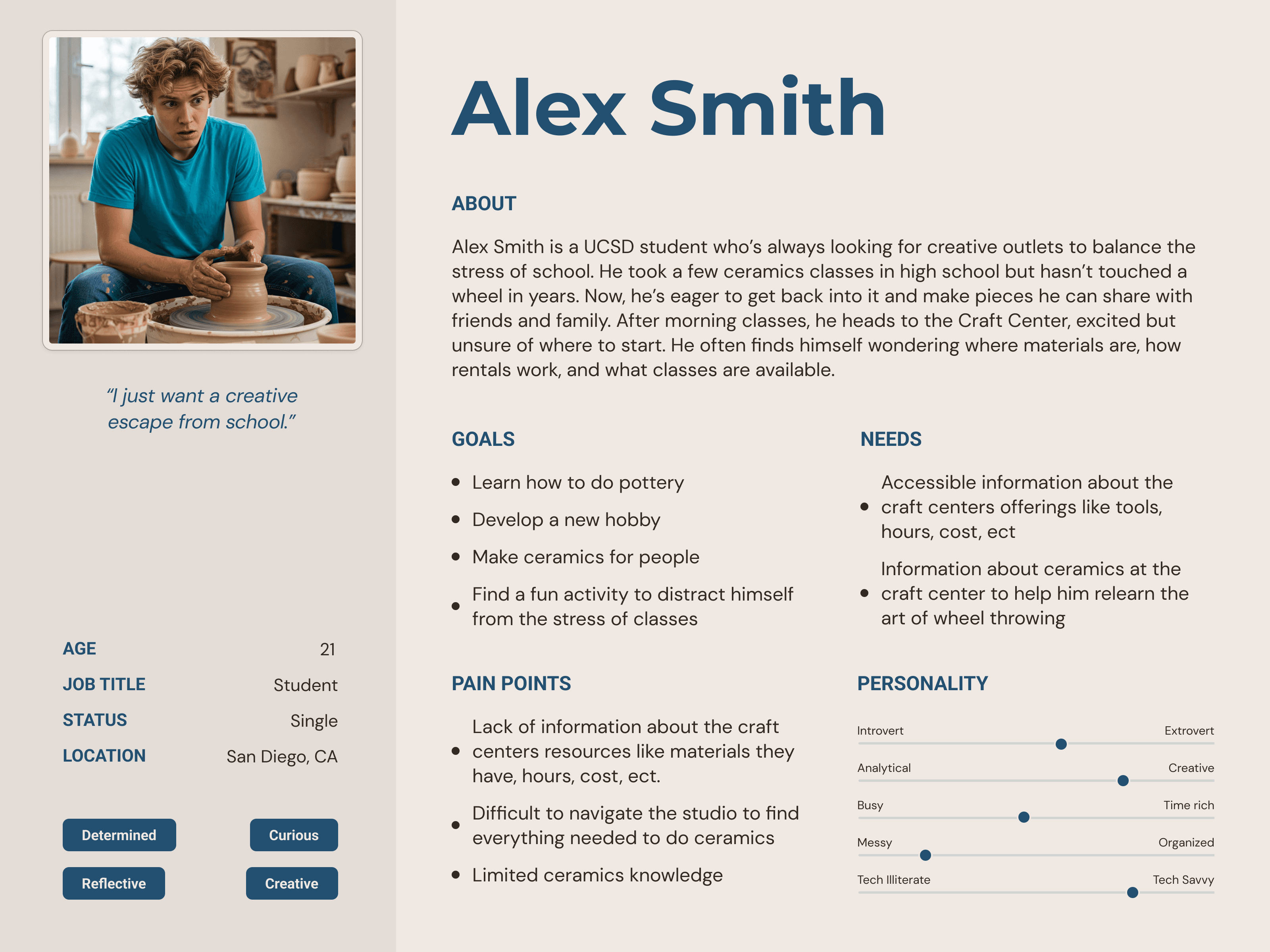
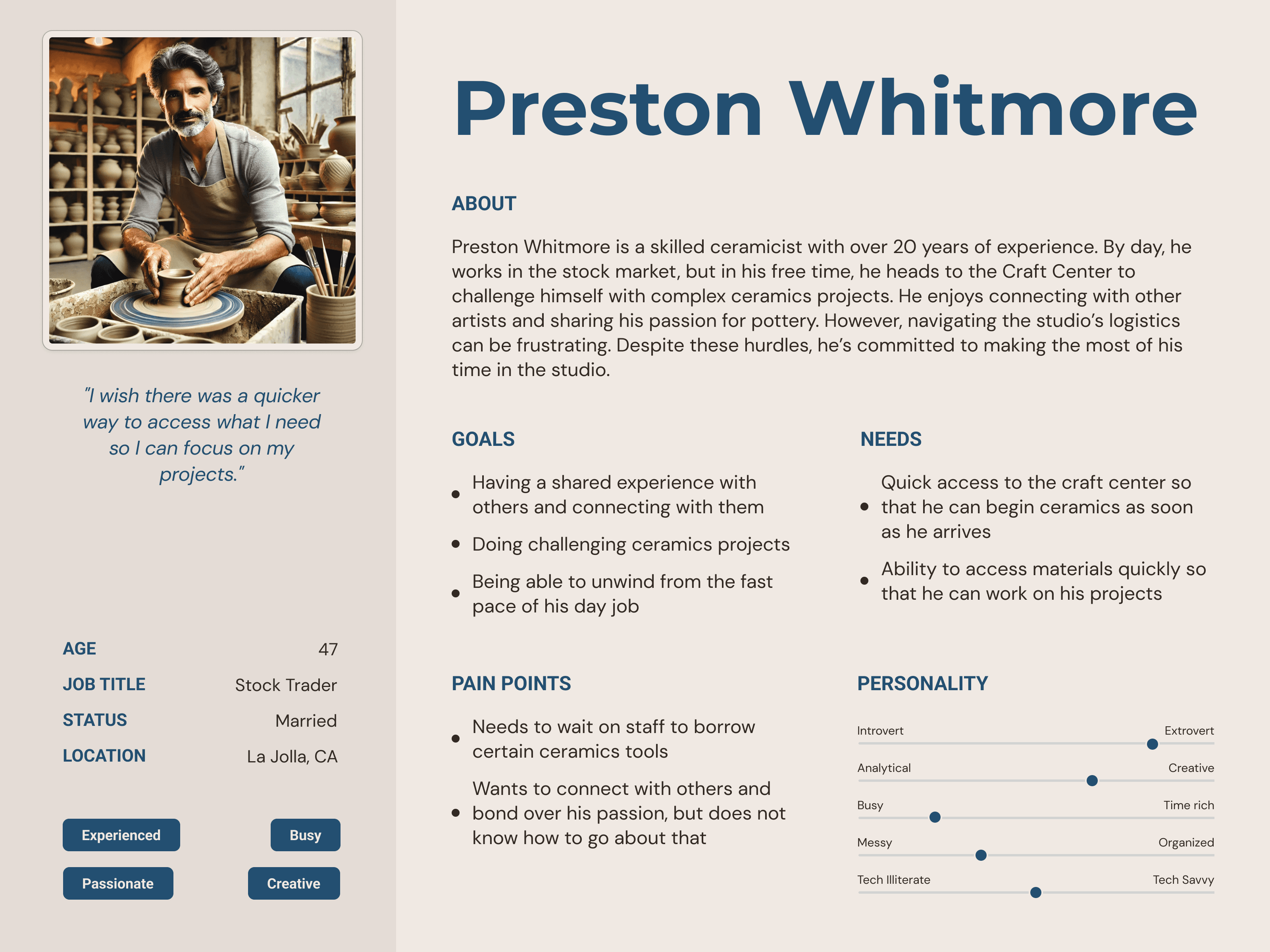
Our Target Users:
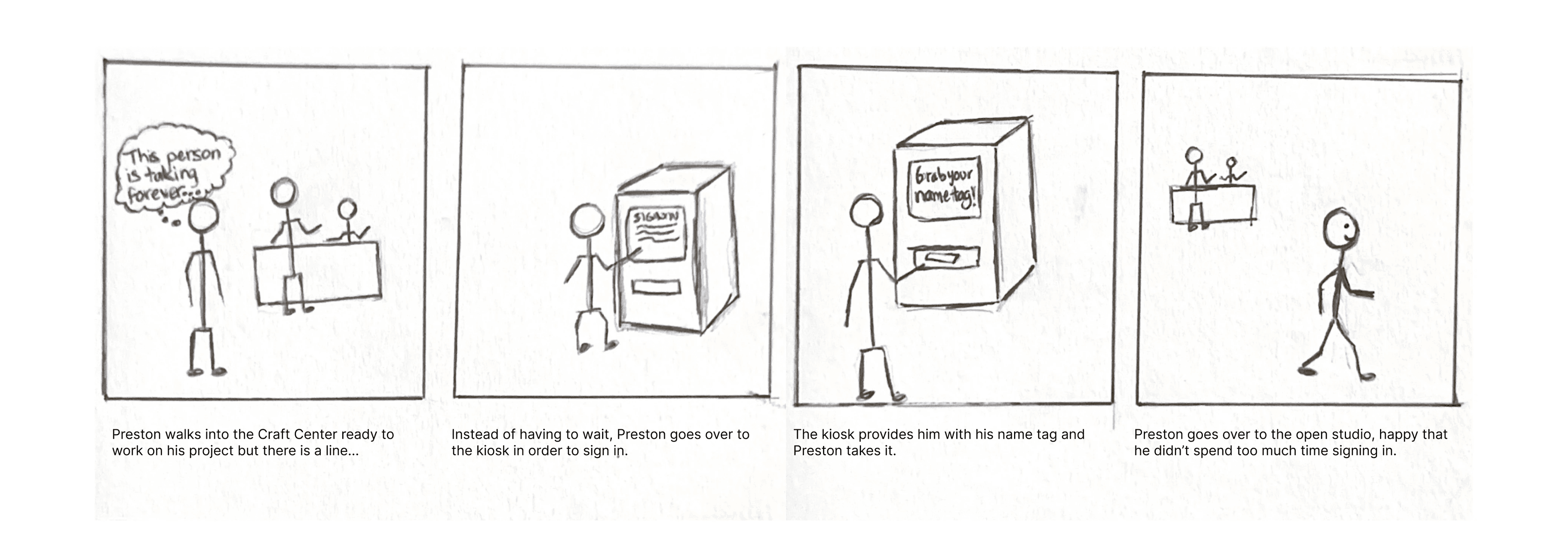
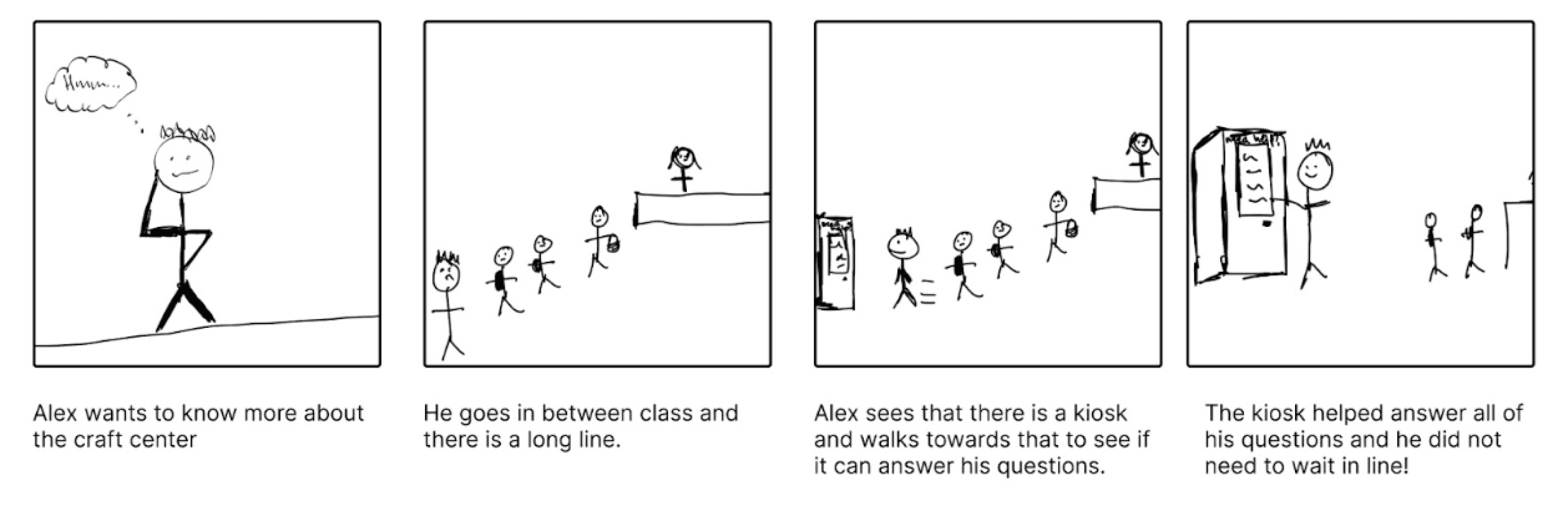
Storyboards:
We also brainstormed user scenarios and storyboards, illustrating potential solutions for streamlining the ceramicist's’ experience. We then went back to the Craft Center again in order to receive feedback from users, asking them if they relate to the scenario drawn.
Ideation and Lo-Fi Prototyping
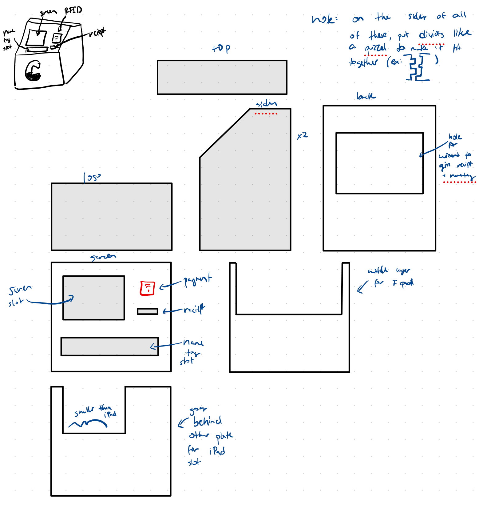
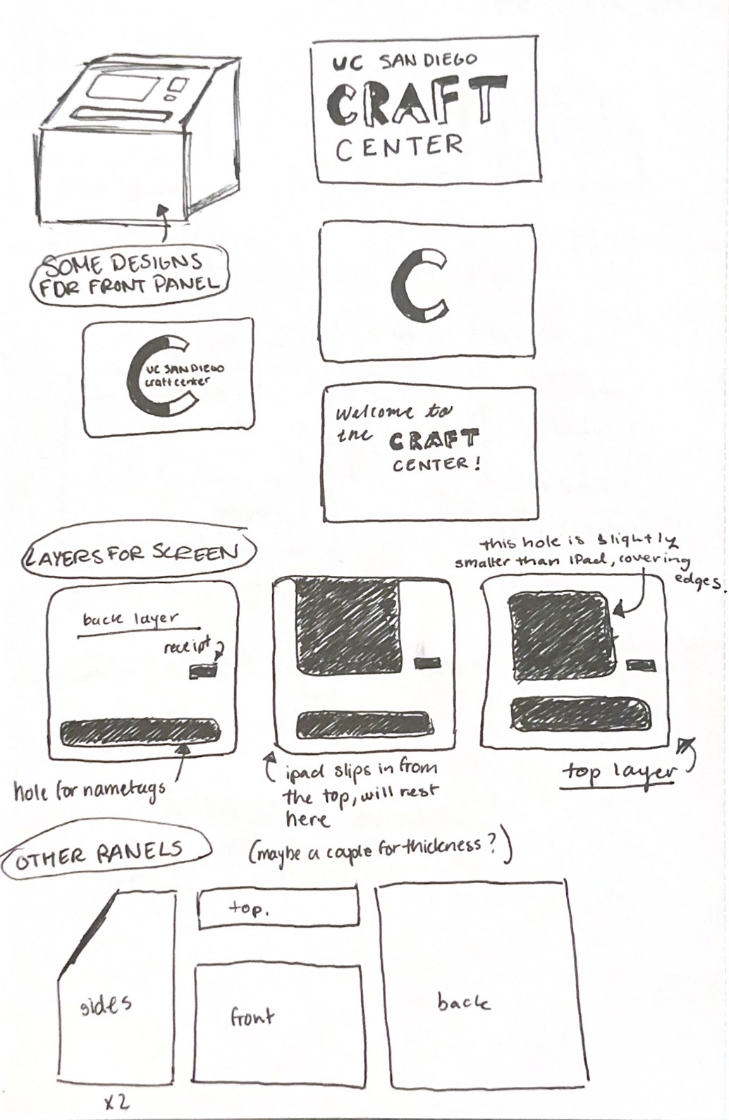
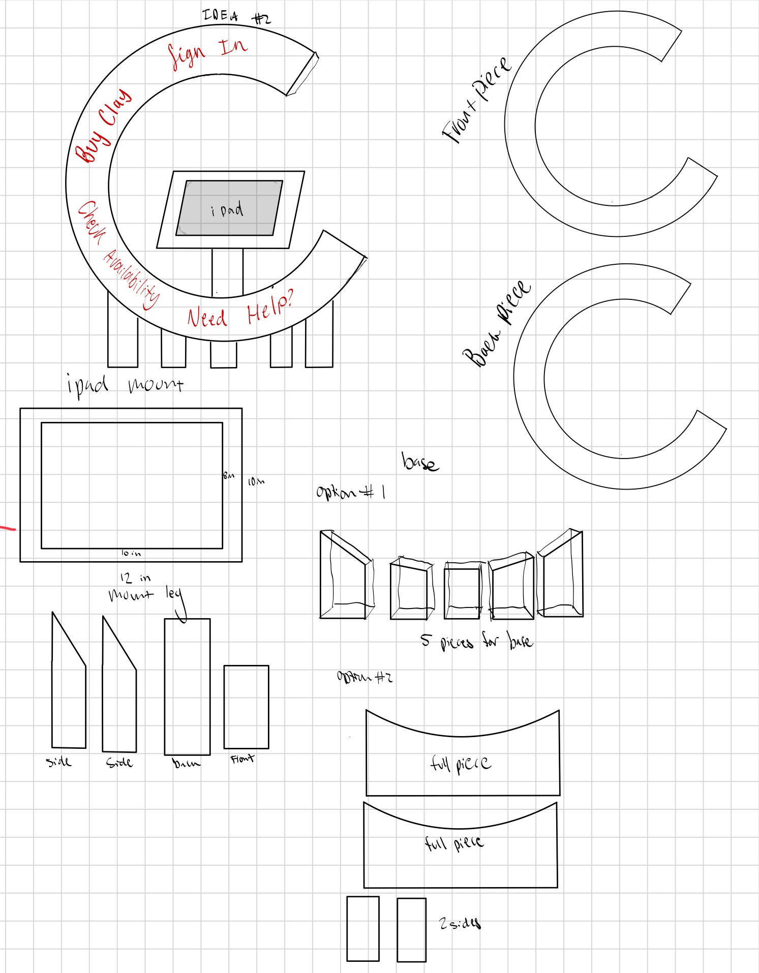
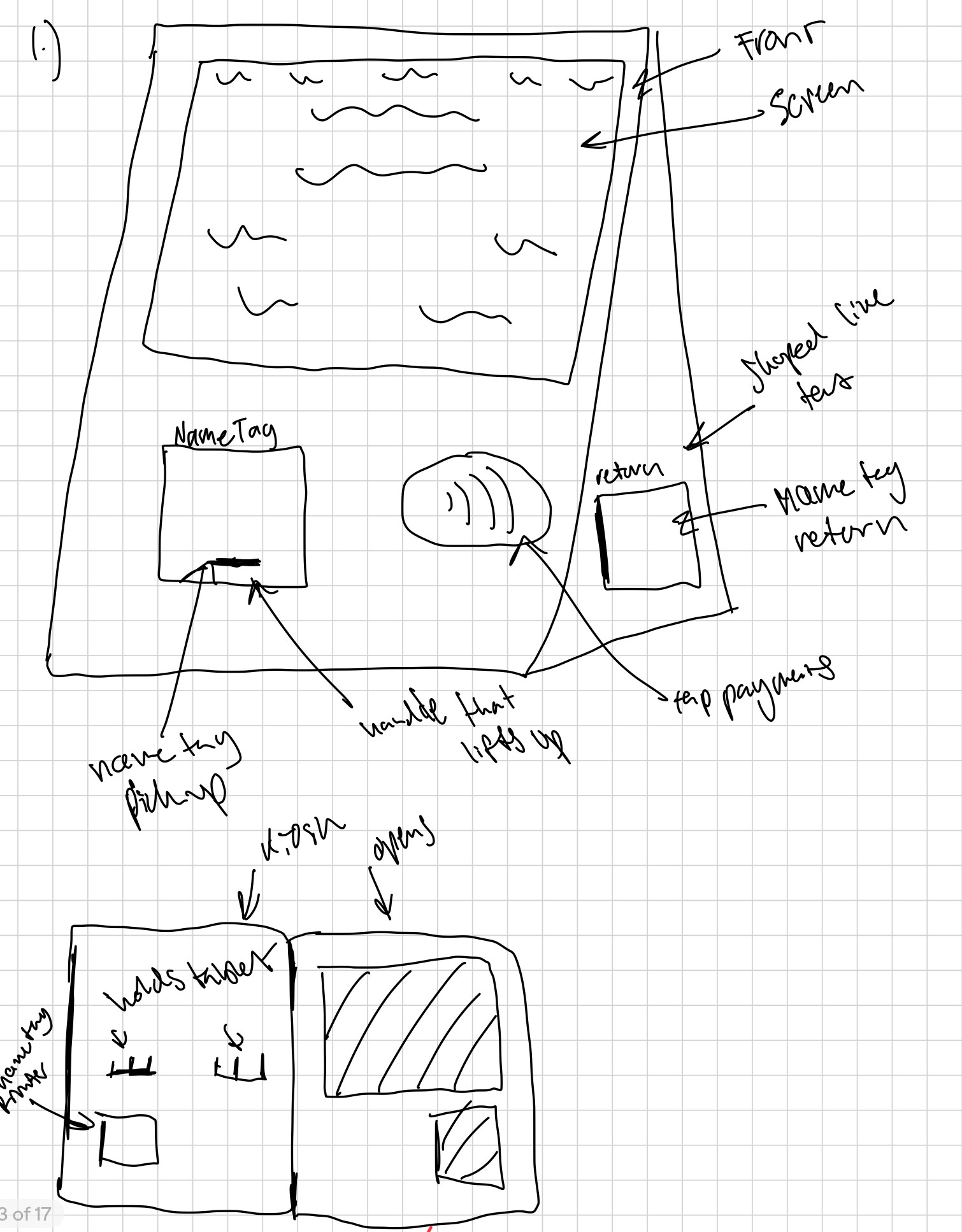
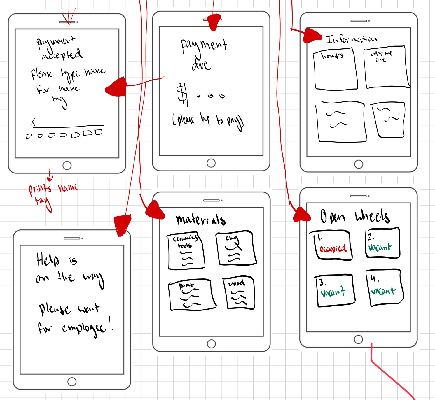
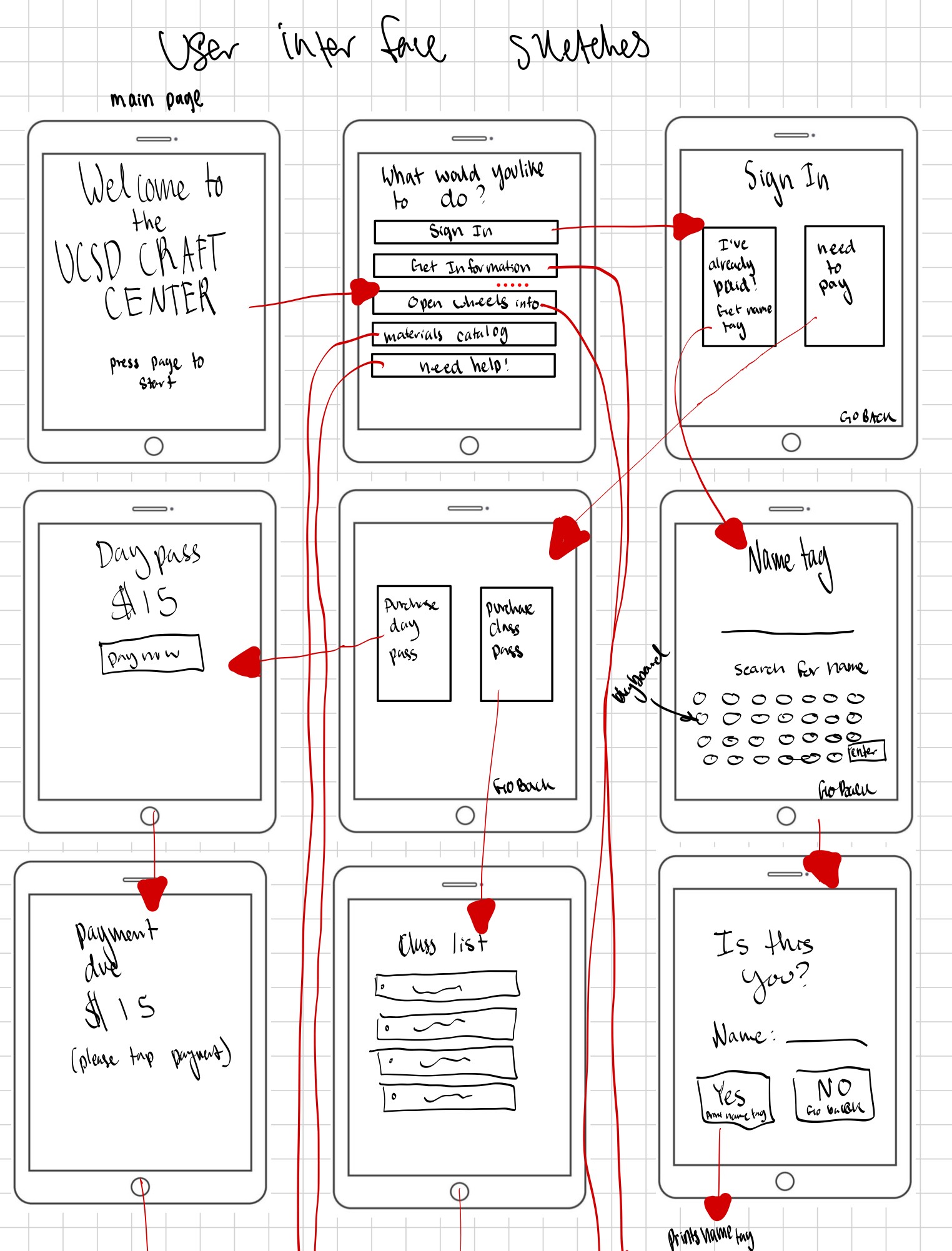
We then began sketching wireframes for both the digital and physical components of the kiosk.
prototype 1
prototype 2
prototype 3
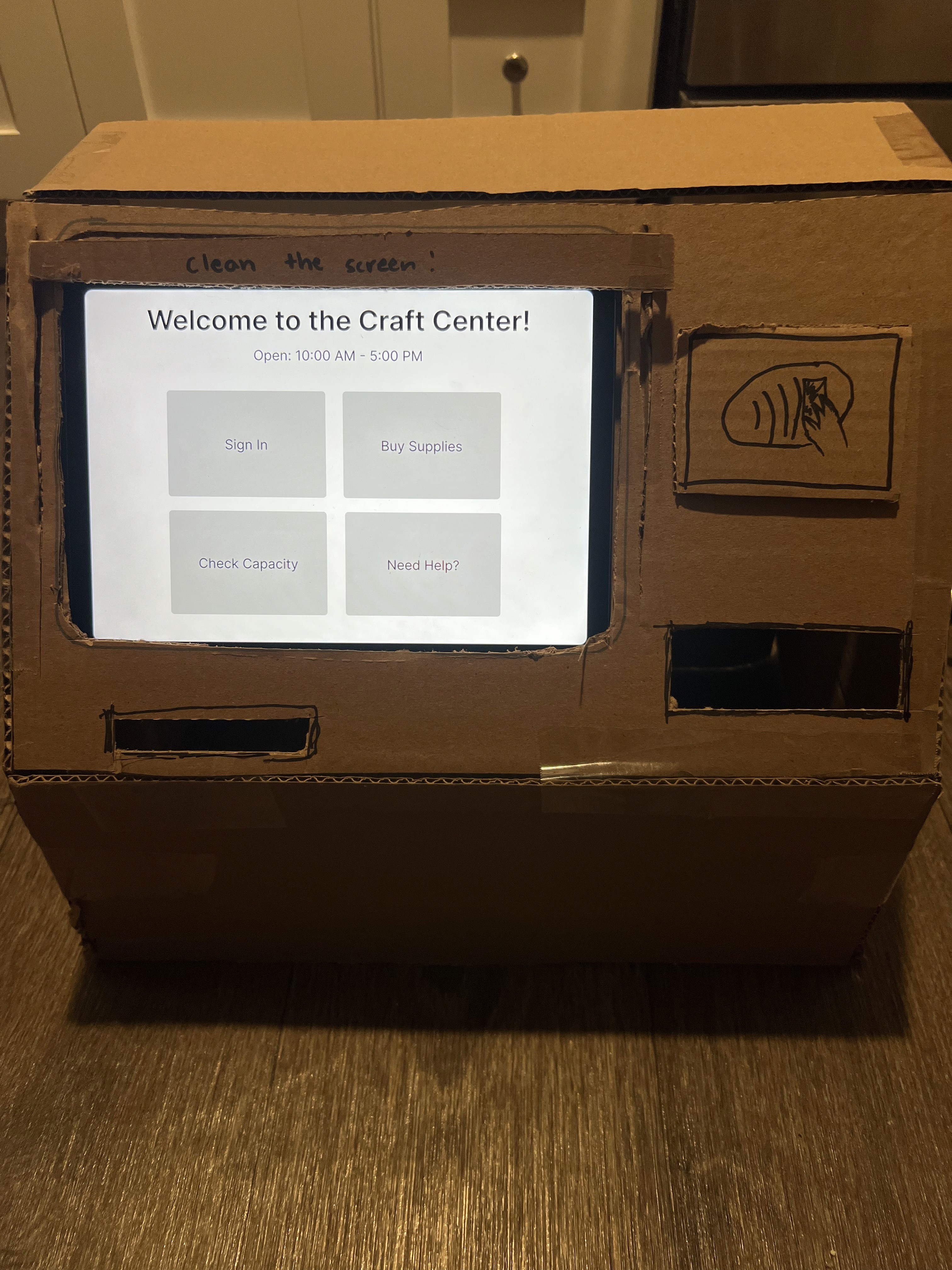
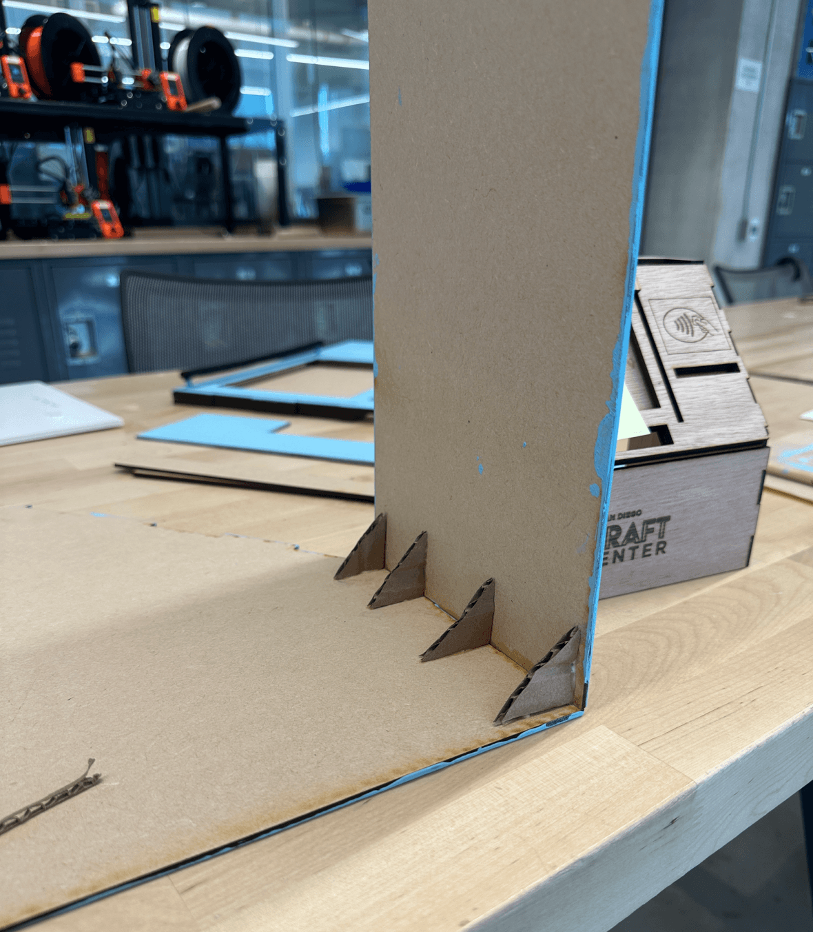
Cardboard Prototype
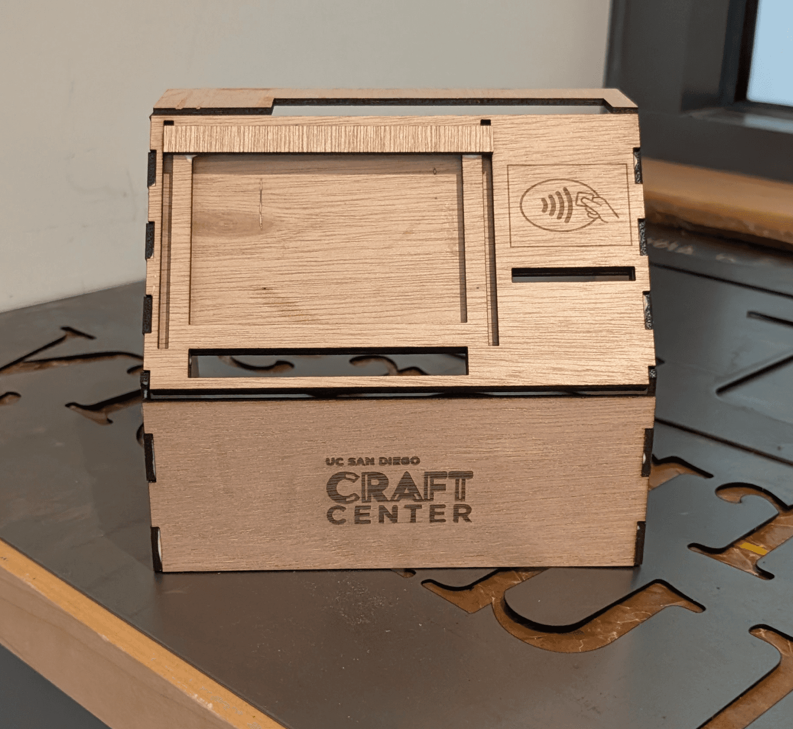
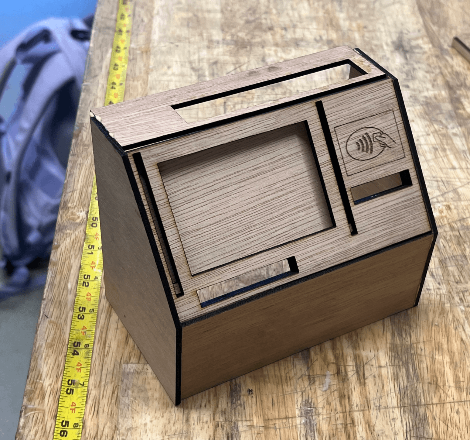
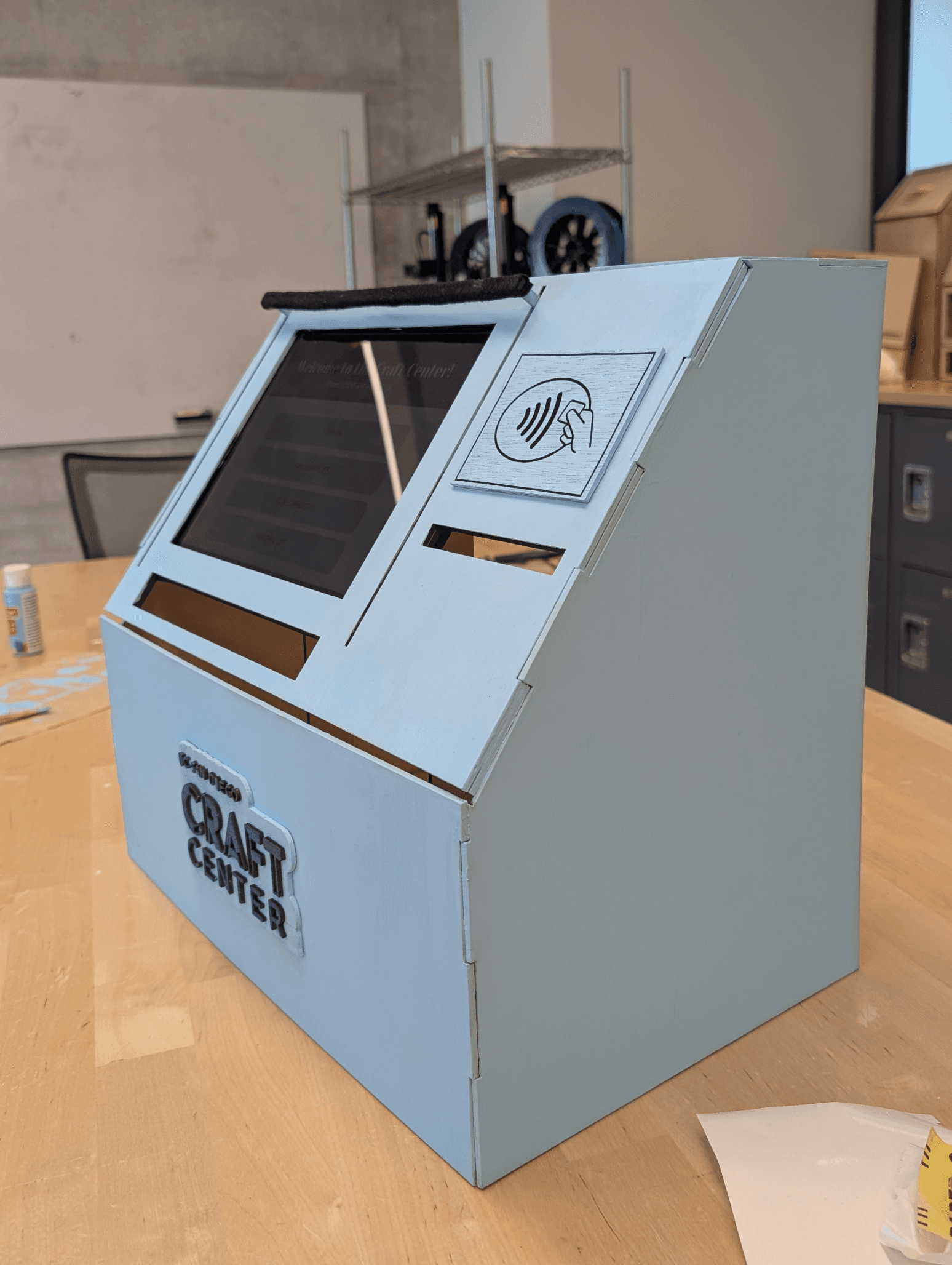
Wood Prototype before slots
Wood Prototype with slots
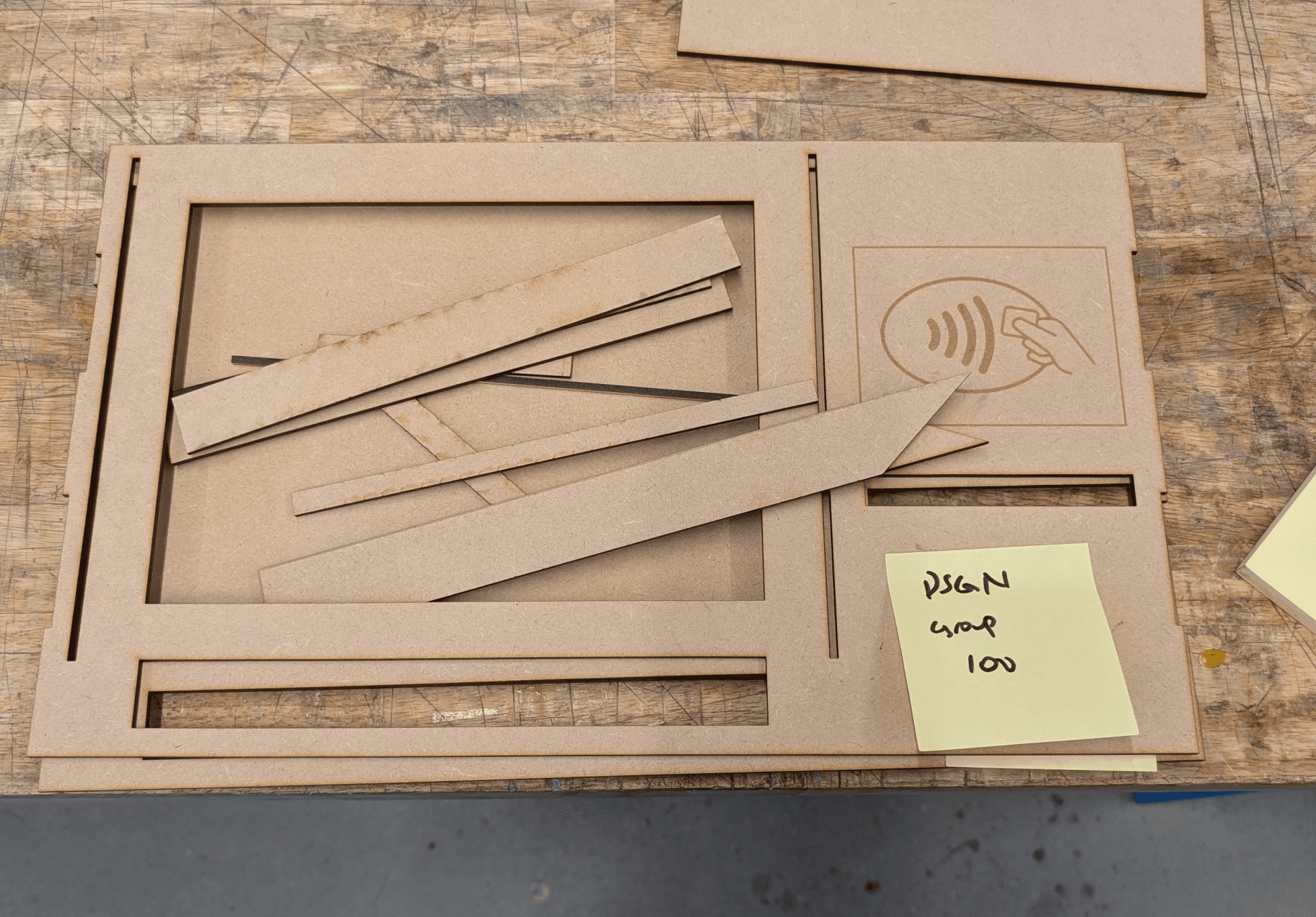
We went with one of these designs above and made a cardboard prototype. We took its dimensions and began the design on Inkscape, which brought us to our second prototype. We then made some final changes and added slots to our final lo-fi prototype as shown below.
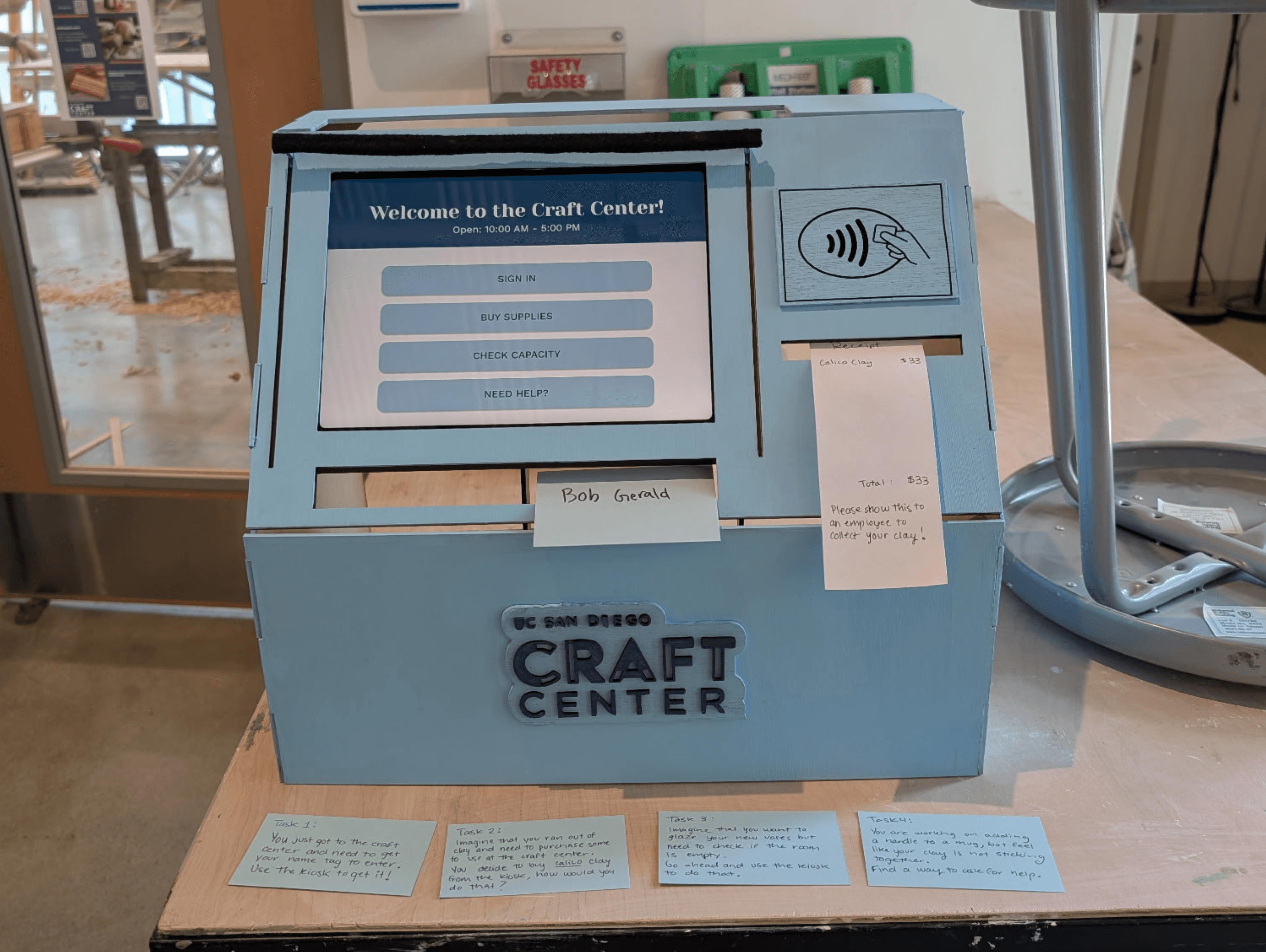
The High-Fidelity Prototype
Usability Testings
We then went back to the Craft Center again to test out our kiosk, providing the users with these written tasks:
You just got to the craft center and need to get your name tag to enter. Use the kiosk to get it!
Imagine that you ran out of clay and need to purchase some to use at the craft center. You decide to buy calico clay from the kiosk at the front desk. How would you do that?
Imagine that you want to glaze your new vases but need to check if the room is empty. Go ahead and use the kiosk to do that.
You are working on adding a handle to a mug, but feel like your clay is not sticking together. Find a way to ask for help.
Key Insights
We learned that users wanted a way to reserve a space. We had previously just had capacities shown but added the ability to make reservations soon after.
Users needed a signifier after they have added items to the cart. They were unsure if they successfully added an item to their cart.
After paying, users were unsure if their payment was processed.
Ceramicists were unsure on how to return to the home page after or during tasks.
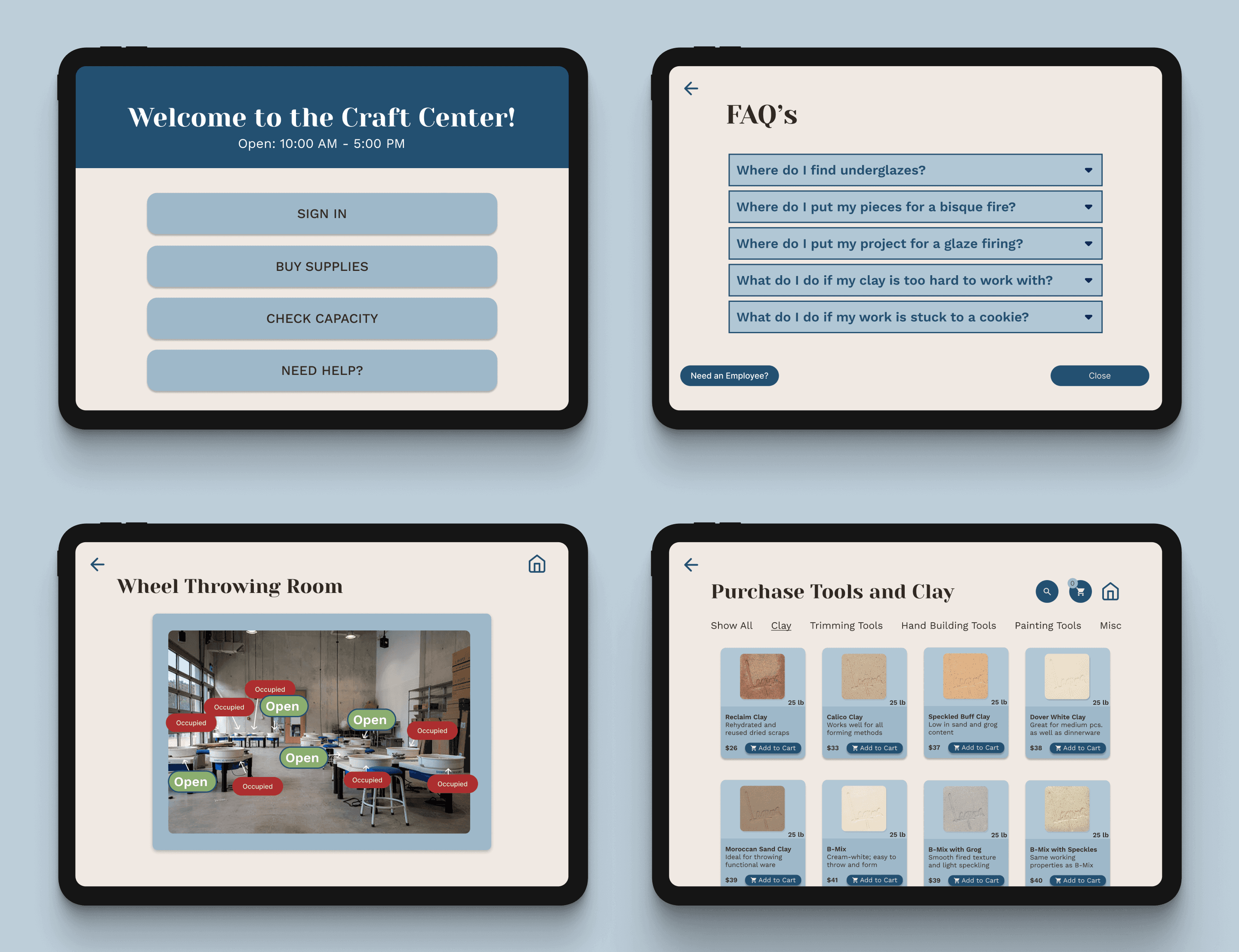
The UX Flows:

Checking-in & retrieving your name tag

Purchasing tools and clay

Checking capacity & reserving a space

FAQs & help button
Lessons & Next Steps
I thought this project was especially unique in that I was able to design the physical and digital components of this interactive kiosk. It felt great to design something for a space that felt was needed. And the result seemed to be greatly appreciated by everyone at the studio!
Lessons Learned
After our final iterations, we received yet additional feedback from out TAs and professor! Some changes we would make to our kiosk:
Adding a confirmation screen when making reservations as this seemed to not be as clear as we hoped.
Explore more UX flows in order to try different pathways such as renting out tools.
As for the physical kiosk, my team would have liked to decorate it more in order to reflect the creativity and space of the Craft Center.
Next Steps
Feel free to contact me to discuss everything and anything at all!
Email: lorena.rez17@gmail.com
Phone: (760)201-6199
Let’s Connect!