Redesigning NCCCA's Website
Collaborating with the North County Climate Change Alliance to redesign their website, I created a clearer structure and engaging digital experience that empowers communities to take action on climate change.
Mentors
Design for America & NCCCA board
Duration
March 2025-June 2025
Team
ME
Process
Stakeholder Interviews, Competitive Analysis, Content & IA Audit, SWOT Analysis, Prototyping, Wix Implementation, Handoff Guide
Tools
Figma, FigJam, Wix, Google Slides, & Google Forms
Project Overview
The North County Climate Change Alliance (NCCCA) is a volunteer-driven nonprofit dedicated to empowering communities to take action on climate disruption through education, collaboration, and mobilization. I partnered closely with NCCCA board members, including chair board Joe Houde and Niels Lund, meeting weekly to gain insight into the organization’s goals, challenges, and audience needs.
Through this collaboration, I identified opportunities to redesign their website to better highlight events, streamline resources, and strengthen community engagement.
My Role
UX/UI Designer
Tools
Figma
The Problem:
How might we redesign NCCCA’s website to empower visitors to engage with climate action by exploring educational content, staying informed about current events, and supporting local initiatives - all while keeping the site simple for the organization to maintain and grow?
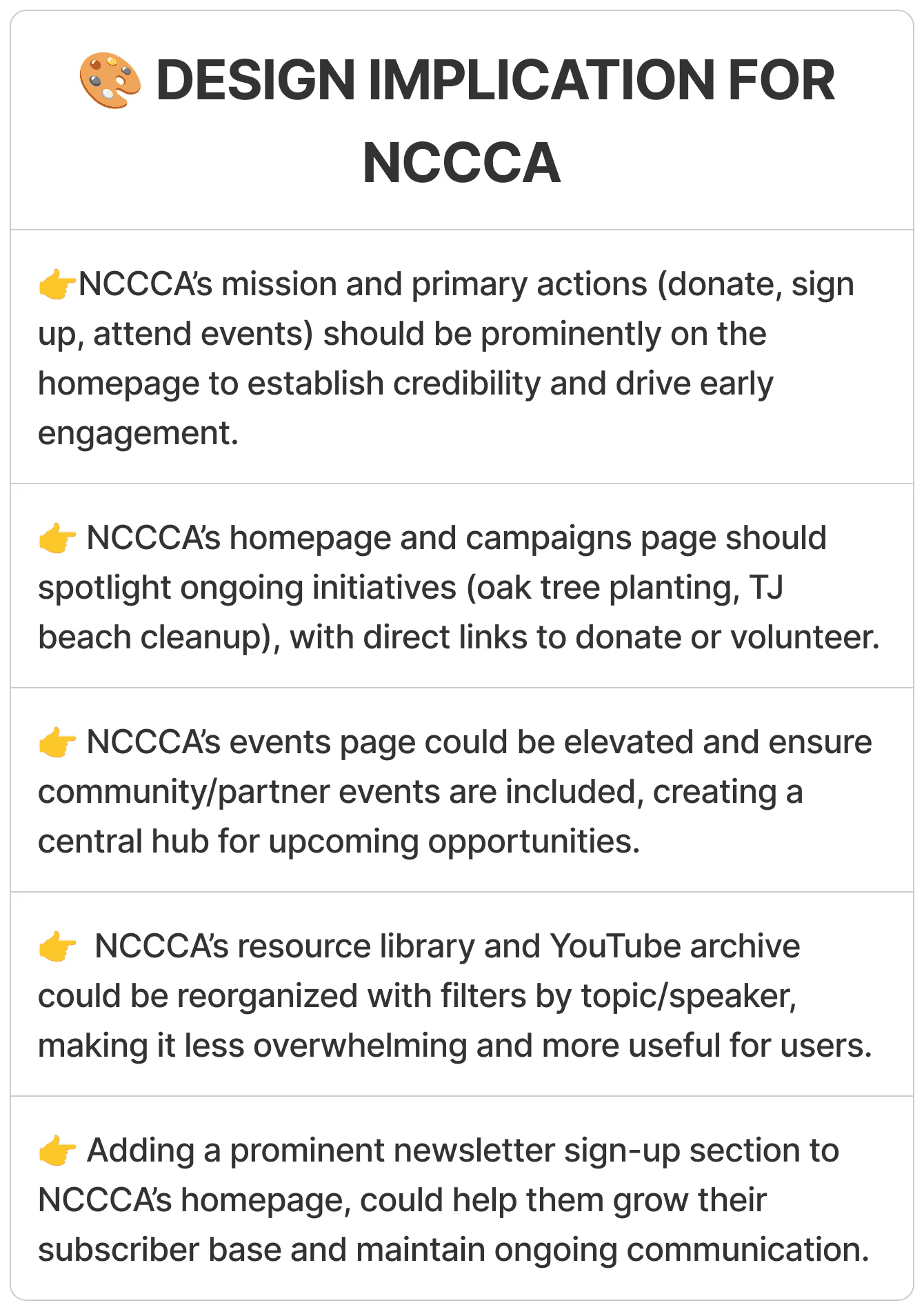
Make video content accessible and organized! Highlight NCCCA’s YouTube speaker events by allowing users to filter by topic and search by speaker, making it easier to find specific content.
Showcasing upcoming events - both hosted and community-based. Ensure all relevant events, including those mentioned at meetings or those hosted by partner organizations are visible and easy to access on the site.
Create a dedicated space for active campaigns and projects. Feature ongoing initiatives such as the oak tree planting effort, making it easy for users to learn more and contribute through donations.
Promote environmental education. Curate recommended books, articles, films, and other resources, while also spotlighting local partner organizations!
Overall, to build a space that feels welcoming, informed and action-driven!
The Goal:
Design Process
To accomplish these goals, I completed the following steps:
Conducted Stakeholder Interviews
Website Audit & SWOT Analysis
Competitive Analysis
Navigation Sitemap
Prototype & UI Design
Wix Implementation
Creating the Handoff Guide
Empathize
Ideate
Understand
Define
Prototype
UX Research - Stakeholder Interviews
1
The purpose of the site is to educate around climate and environmental topics and to advocate and collaborate with others.
2
Joe wants to create a space for campaigns in order to raise money for ongoing projects such as their Oak Tree Campaign.
3
Joe wants to highlight NCCCA's educational speaker events as well as promote their YouTube channel.
4
Website is not necessarily geared towards younger kids, but targeted towards older members of the community.
Throughout this 10-week project, I collaborated closely with NCCCA Board Chair, Joe Houde, and Board Member, Niels Lund, through weekly meetings. These sessions began as exploratory interviews to understand the organization’s goals and evolved into regular feedback and co-creation sessions as the design progressed.
Here are some examples of questions I had prepared:
What do you see as the main purpose of the website?
What do you want visitors to do on the website? (sign up for events, donate, be informed on issues, etc)
What is your target user? Primary users? Secondary users?
Are you active on social media platforms? (Instagram, Facebook, newsletters, etc). How can we make sure there is cohesion between these platforms and the website? Ex: Facebook, Linkedin, Youtube
Any specific pain points you’ve heard from users about the current site?
Some Highlights:
These ongoing discussions shaped each design iteration, ensuring the final website reflected both organizational goals and user needs.
UX Research - SWOT Analysis
To better understand NCCCA’s existing website, I began with a comprehensive content and structural audit. I analyzed each page to evaluate its purpose, hierarchy, and effectiveness in supporting the organization’s goals.
Every element was assessed through a SWOT framework—identifying strengths to preserve, weaknesses to improve, opportunities for redesign, and potential threats that could arise from structural or content changes. This process provided a clear foundation for understanding how users currently experience the site and where design improvements could make the greatest impact.
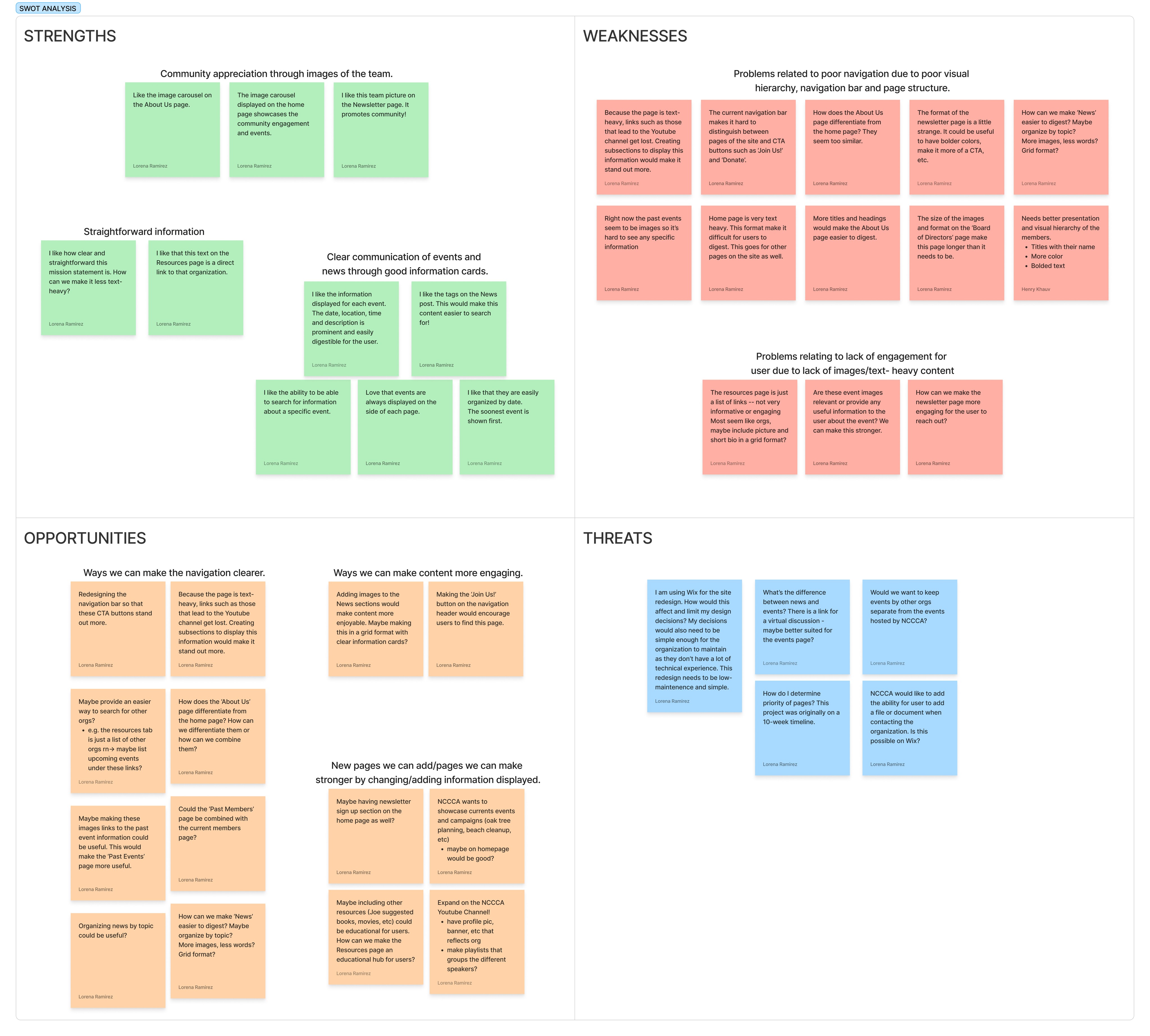
Page Audit - Featuring: Home and Events
SWOT Framework Synthesis
1
There is a clear mission statement but site lacks a clear hierarchy and site structure.
2
Opportunities to unify event content and 'About Us' content in order to simplify navigation.
3
Some content such as their YouTube channel is not easily accessible for users.
4
Opportunity to create an educational hub for users, building on existing resources page.
5
Site maintenance must remain simple for the organization.
Key Findings:
UX Research - Competitive Analysis
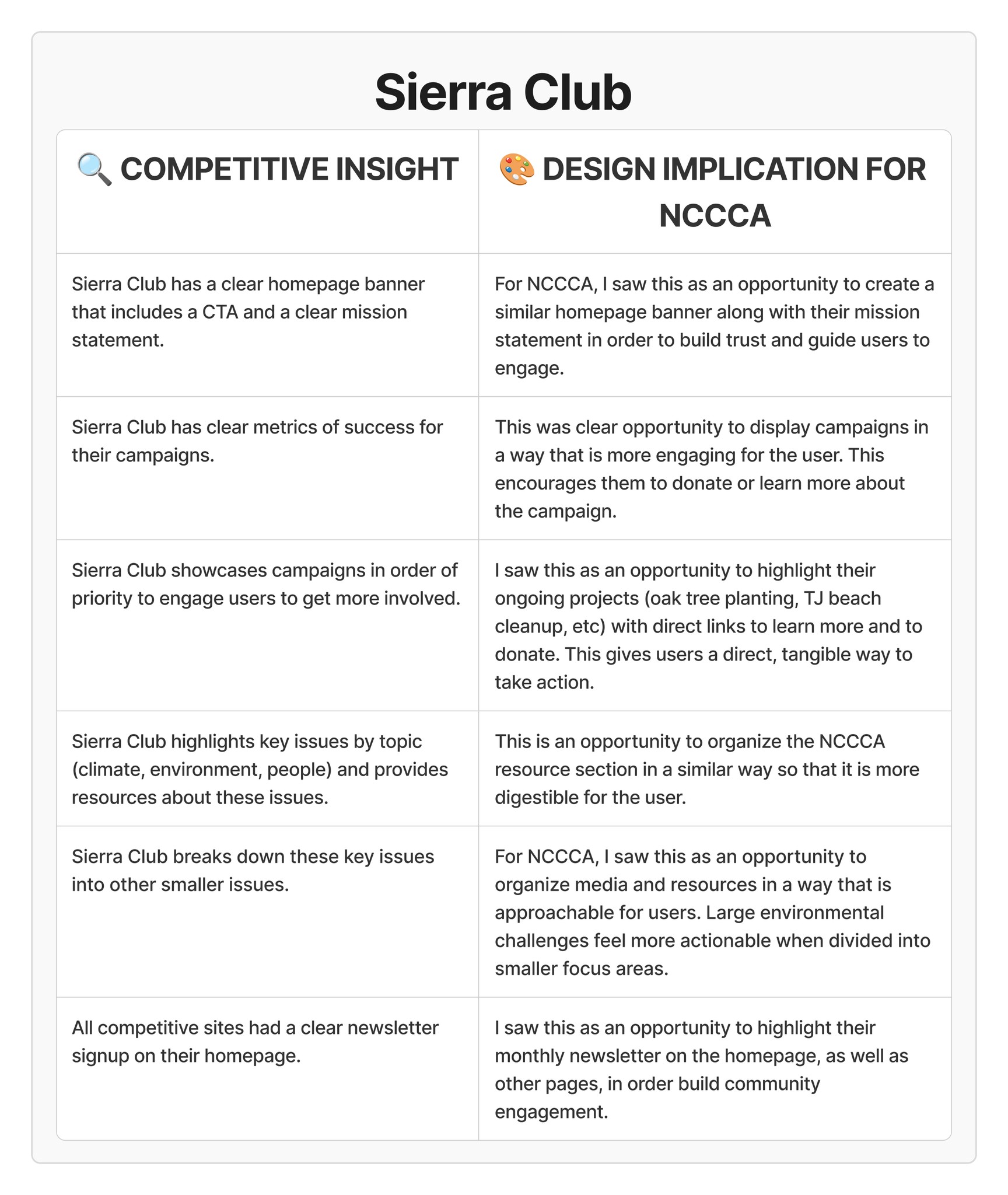
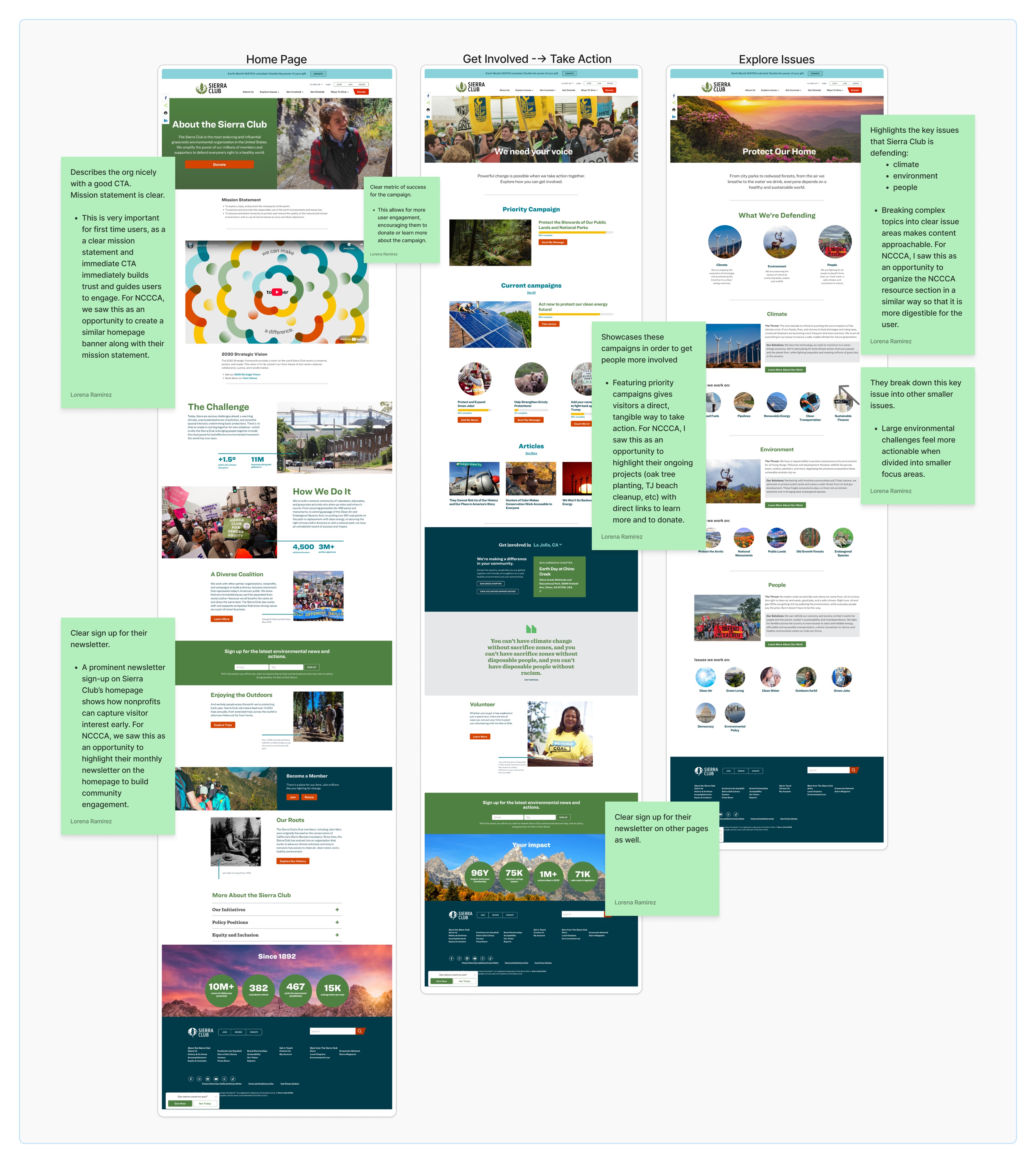
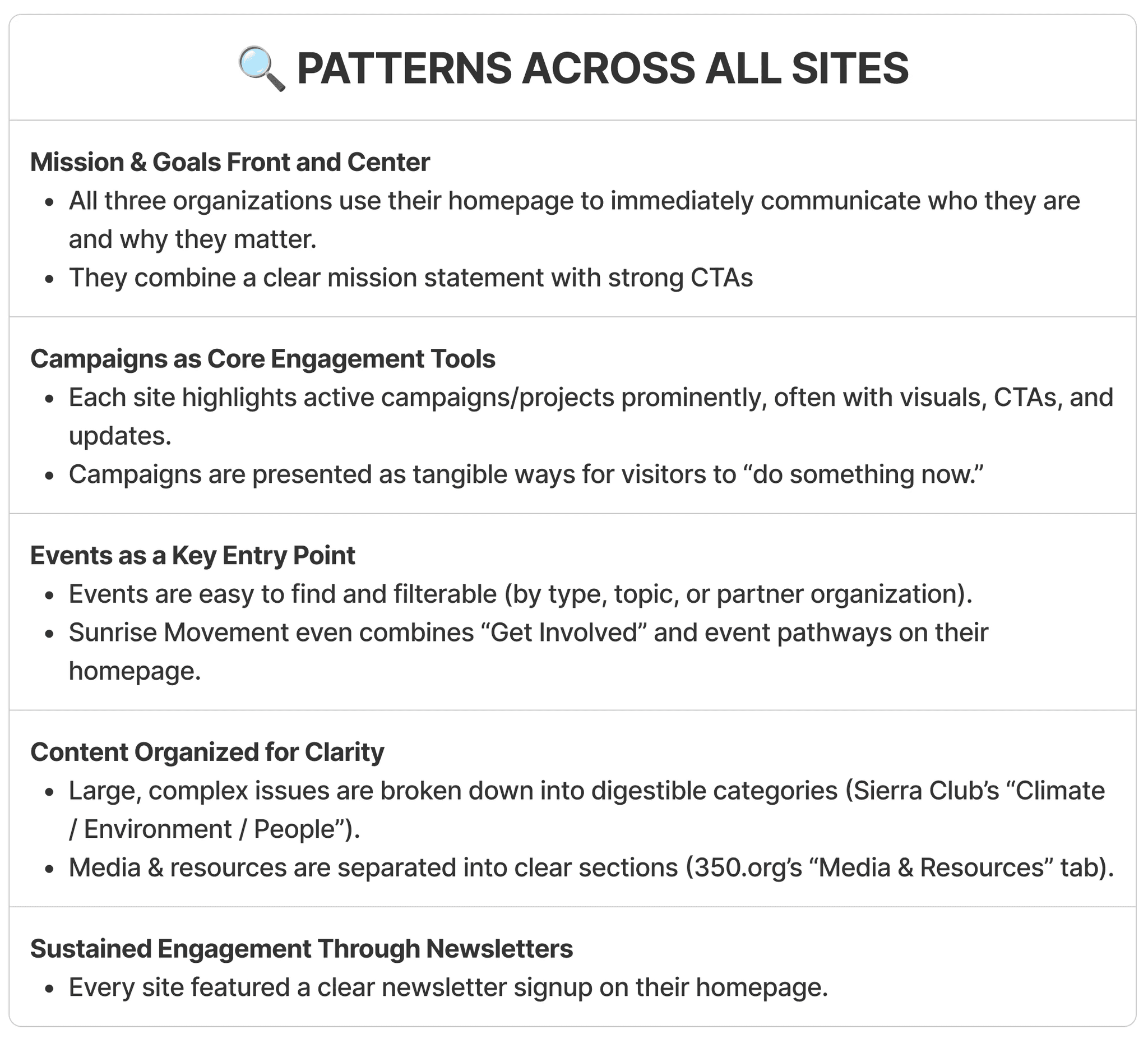
To better understand best practices in nonprofit environmental websites, I analyzed leading organizations including Sierra Club, 350.org, and Sunrise Movement. The goal was to identify how these organizations highlight events, educational content, and campaigns to inspire engagement and action.
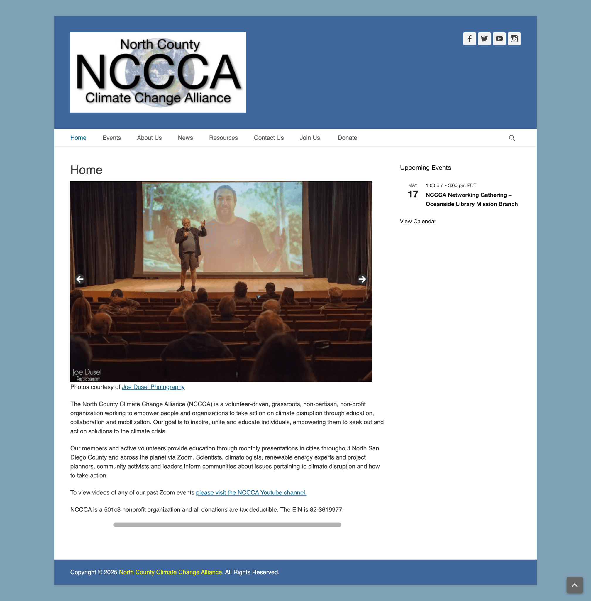
Here’s a look at the original NCCCA website before the redesign.
Sierra Club served as a key reference for understanding how environmental nonprofits effectively communicate their mission, campaigns, and educational resources through structured design and clear calls-to-action.
I repeated this process for 350.org and Sunrise Movement, identifying consistent patterns in how successful nonprofits balance education with action. These insights directly guided the redesign strategy, leading to a more intuitive structure and stronger engagement pathways for NCCCA’s users.
Example Analysis: Sierra Club
I proceeded to repeat this same process for 350.org and Sunset Movement, resulting in the following…
Cross-Site Patterns & Takeaways
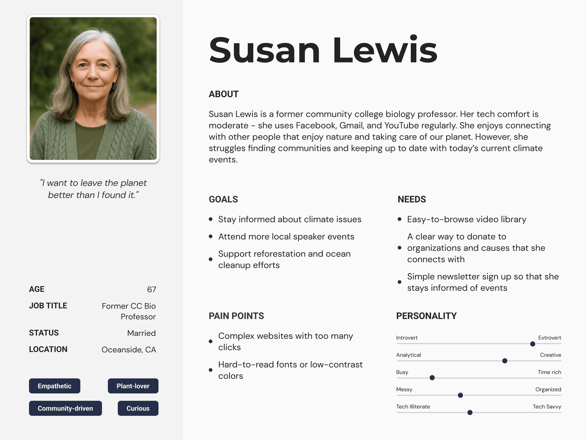
Our Target Users:
Information Architecture and Site Mapping
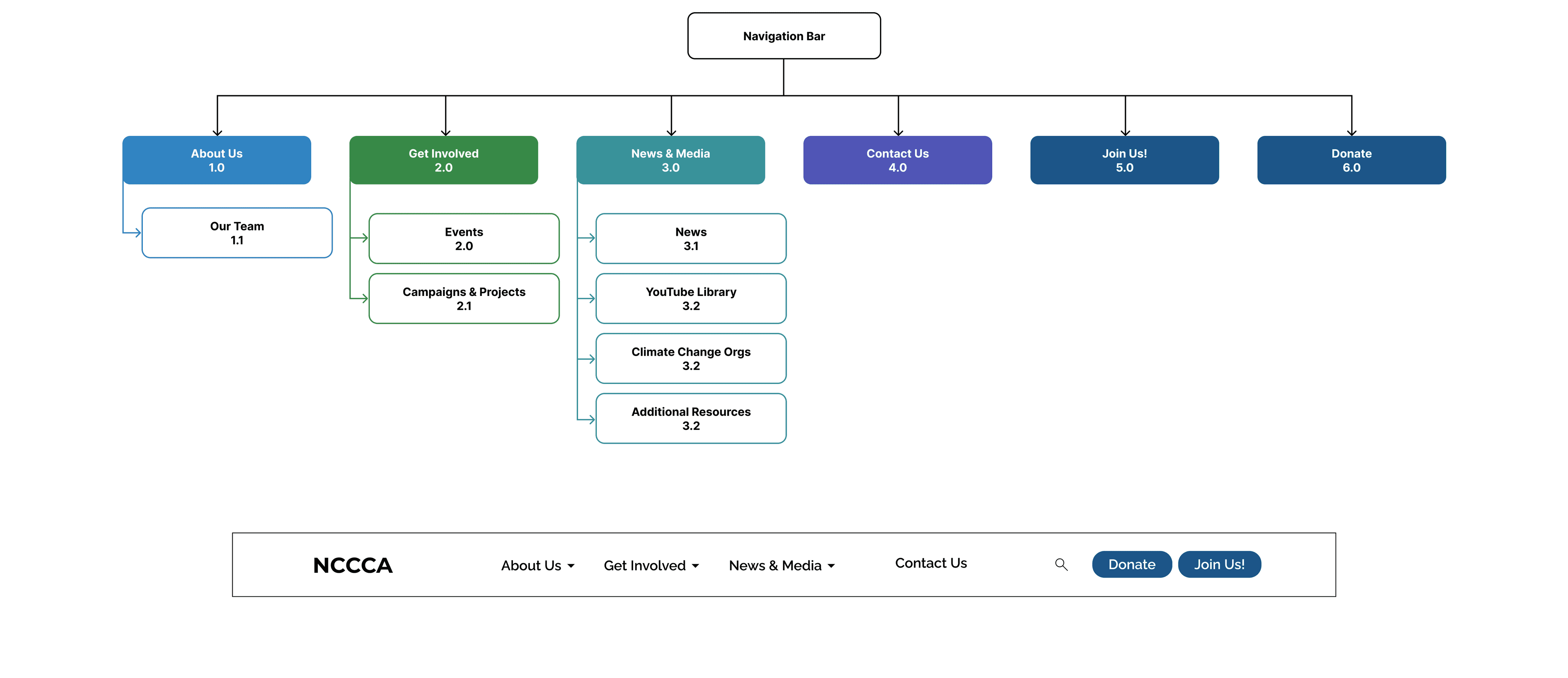
After identifying issues with the original website’s structure—such as redundant pages, unclear hierarchy, and scattered event content—I reorganized NCCCA’s site to create a more intuitive and action-oriented flow.
The goal was to simplify navigation, make key content easier to find, and guide visitors naturally toward engagement opportunities like attending events, supporting campaigns, or learning more about climate action.
Simplified Navigation:
Reduced eight top-level pages to six by merging overlapping content and grouping related actions (e.g., “About Us” and “Home”).
Introduced Campaigns Page:
Created a dedicated space for active projects, reflecting NCCCA’s ongoing community efforts.
Reorganized Events:
Combined past and upcoming events under one section with partner listings to improve discoverability.
Improved Resource Access:
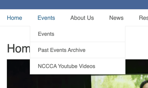
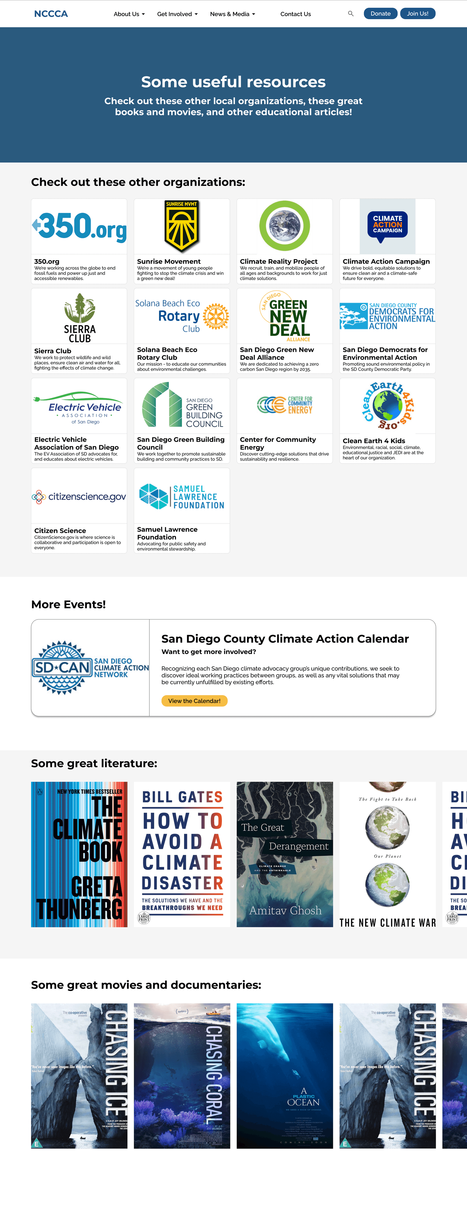
Centralized educational materials and videos under one “News & Media”. Broke down the original "Resources" page into "Climate Change Orgs" and "Additional Resources" to better describe content.
Highlighted Engagement:
Added visible entry points for newsletter sign-up and donating to encourage long-term participation.
By restructuring the website around key user goals—learning, engaging, and supporting—the new information architecture makes it easier for visitors to find what they need while aligning the site’s layout with NCCCA’s mission of education and action.
Key Structural Decisions
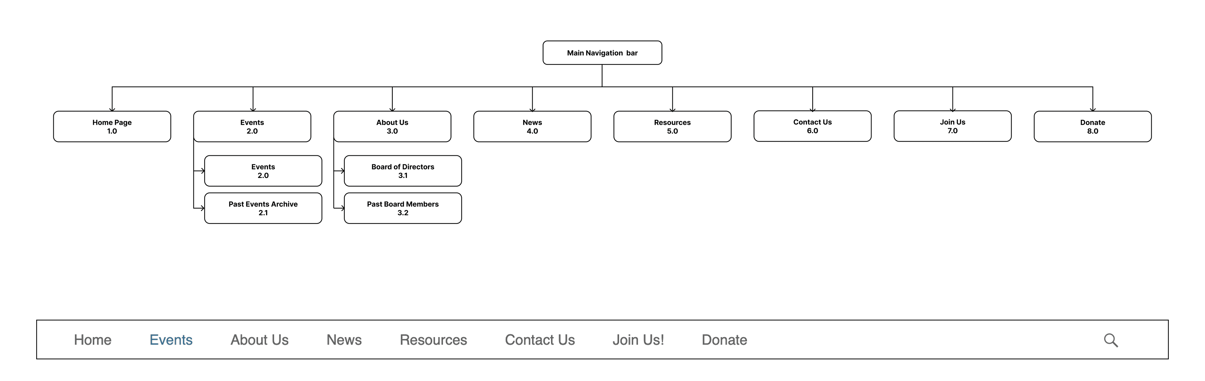
Old Sitemap
Redesigned Site Map
Ideation and Lo-Fi Prototyping
After defining the new site structure, I began sketching and wireframing key pages to explore layout, hierarchy, and user flow. My goal was to create a clean, intuitive experience that makes information easy to scan and guides users toward meaningful actions—like attending events, learning from resources, or supporting campaigns.
The wireframes helped define consistent layouts across pages and clarify navigation patterns. These versions prioritized quick access to NCCCA’s most important content: events, campaigns, and educational resources.
Simplified page hierarchy: Reduced visual clutter by introducing clear content blocks (hero → key initiatives → getting involved → contact & newsletter).
Focused homepage layout: Added featured event and campaign cards near the top to increase user engagement.
Improved navigation visibility: Used a sticky header and simplified menu items based on the new sitemap.
Consistent card layouts: Established a uniform visual structure for event listings and resource links. Broke down resources into organizations and other educational content.
Integrated calls-to-action: Placed “Donate” and “Join Newsletter” buttons within high-traffic sections instead of isolating them.
Key Design Decisions
Low-Fidelity Wireframes
Resources
Our Team
Home
Media Resources V1 & V2
Campaigns
Visual Design System
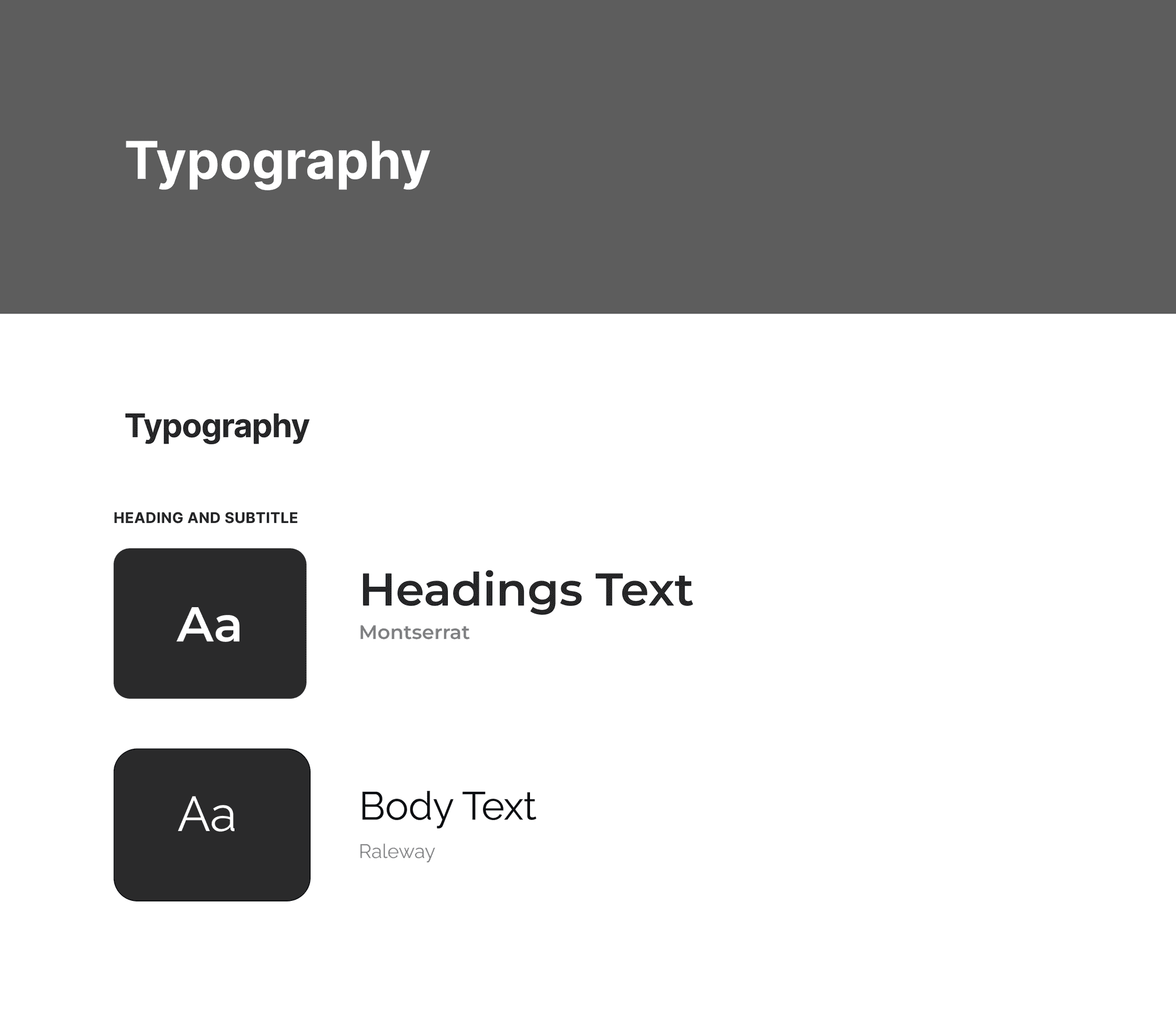
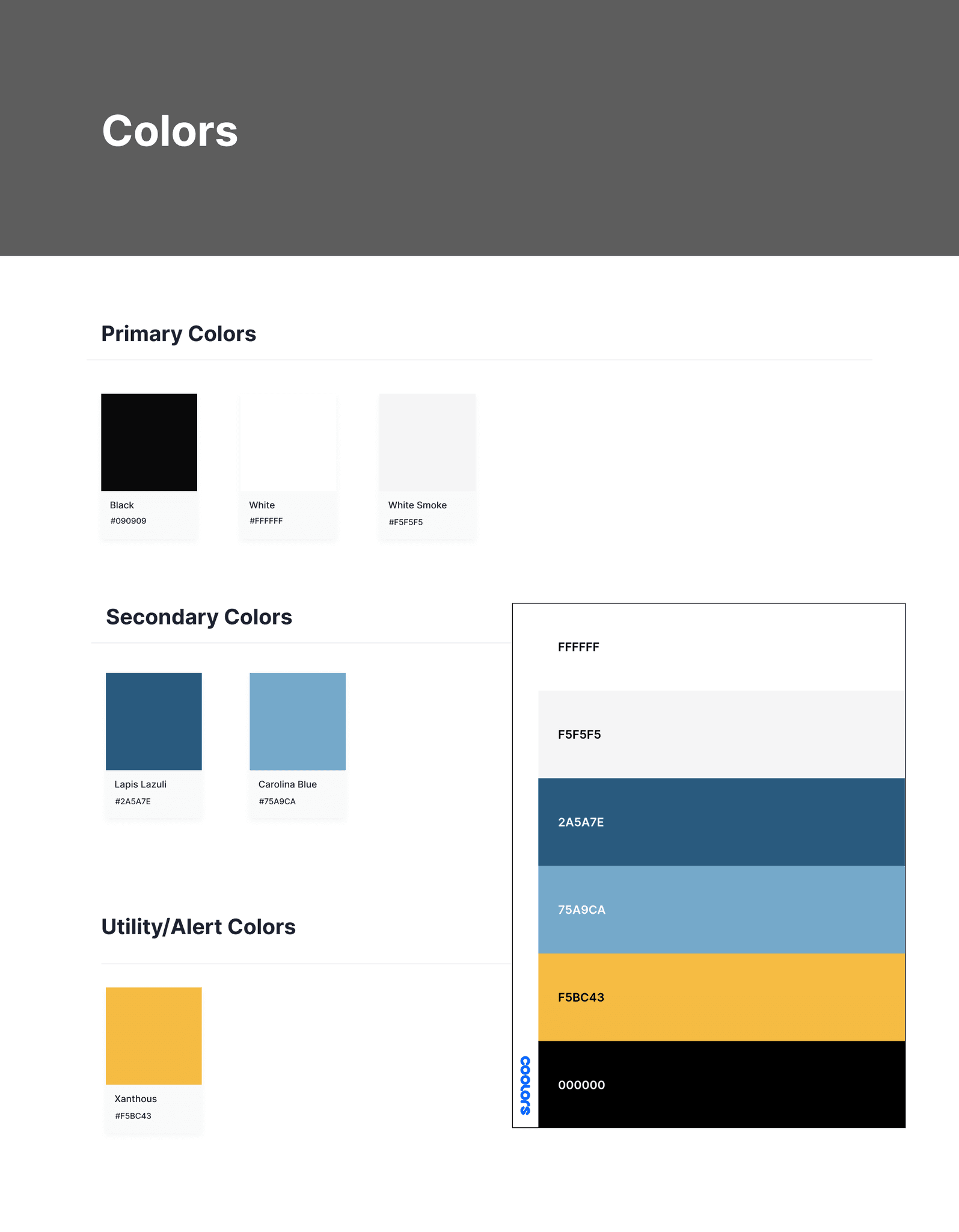
Rather than completely reinventing NCCCA’s visual identity, I chose to refine it. Since the organization already had a recognizable look, my goal was to build on their existing brand foundation—modernizing colors, improving legibility, and establishing consistency across pages. This ensured the redesign felt fresh and cohesive while remaining familiar to returning visitors.
I slightly adjusted NCCCA’s original blue to improve contrast and accessibility, introduced a neutral grey for background sections, and refined accent colors for consistency across campaigns and events.
To improve readability, I simplified the type hierarchy while keeping the organization’s approachable tone.
These subtle refinements to color and typography created a more accessible and cohesive visual language, which carried through to the high-fidelity prototypes.
Establishing a Visual Language
High-Fidelity Prototypes
After defining the new site structure, I began sketching and wireframing key pages to explore layout, hierarchy, and user flow. My goal was to create a clean, intuitive experience that makes information easy to scan and guides users toward meaningful actions—like attending events, learning from resources, or supporting campaigns.
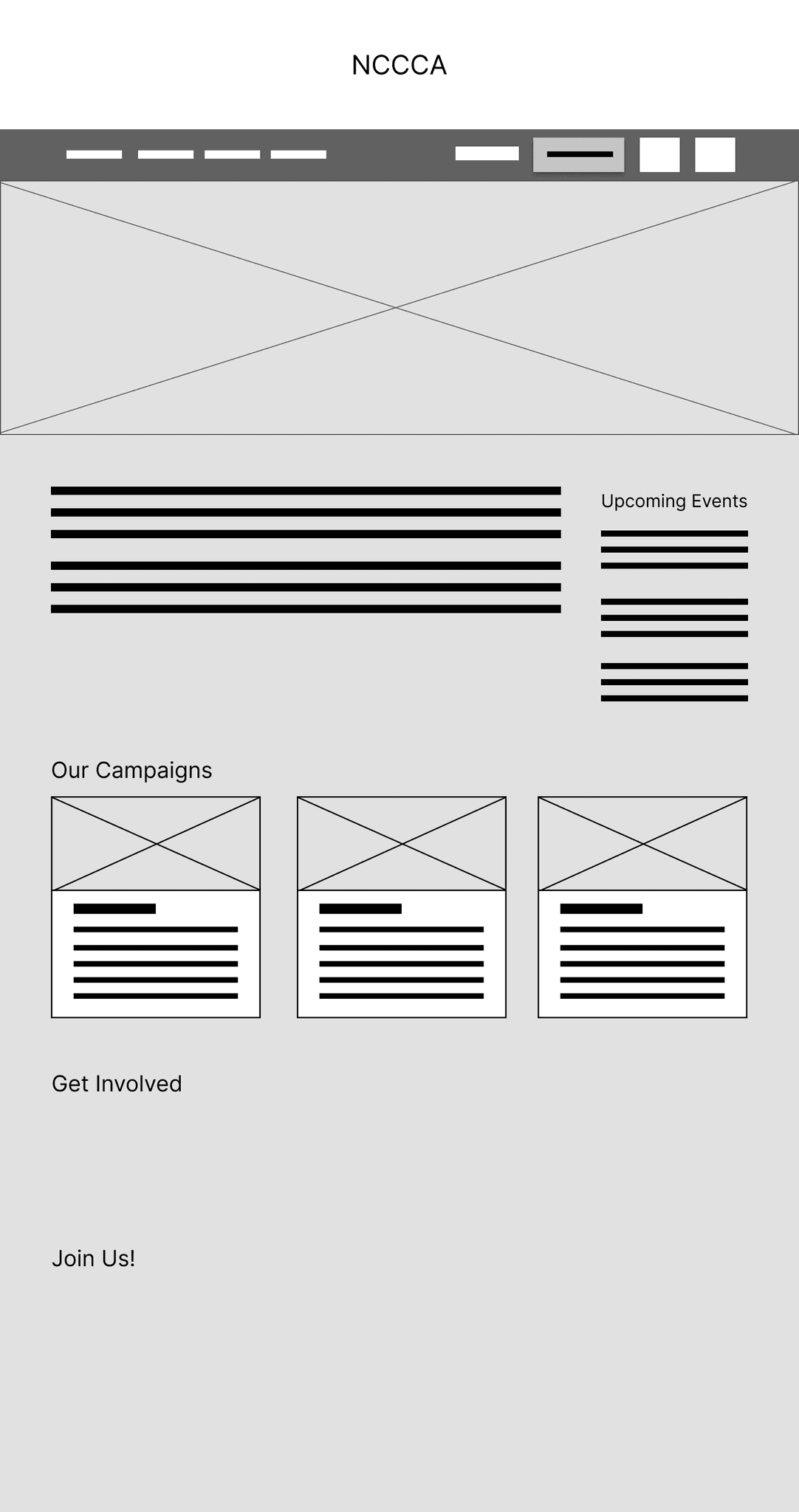
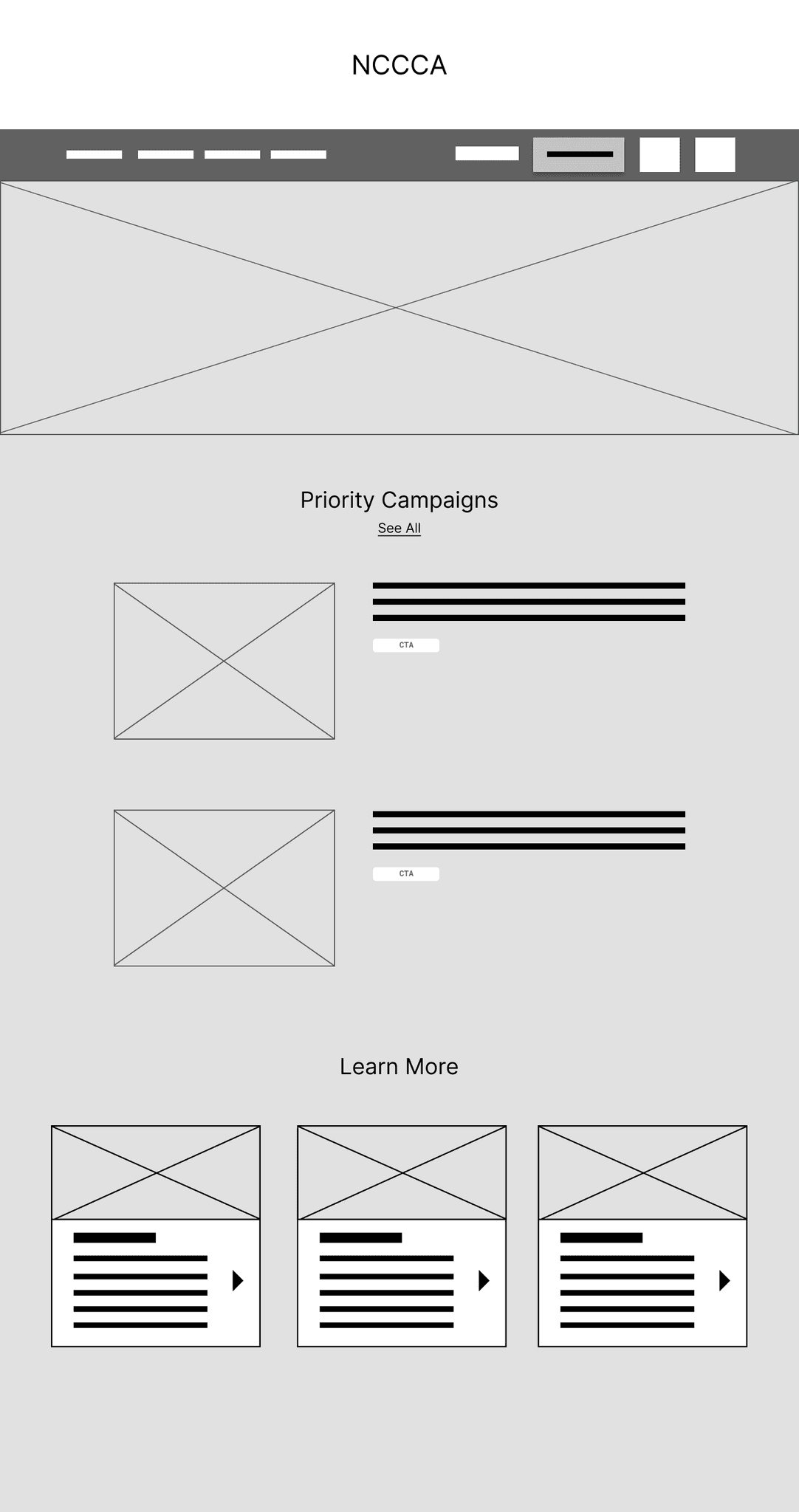
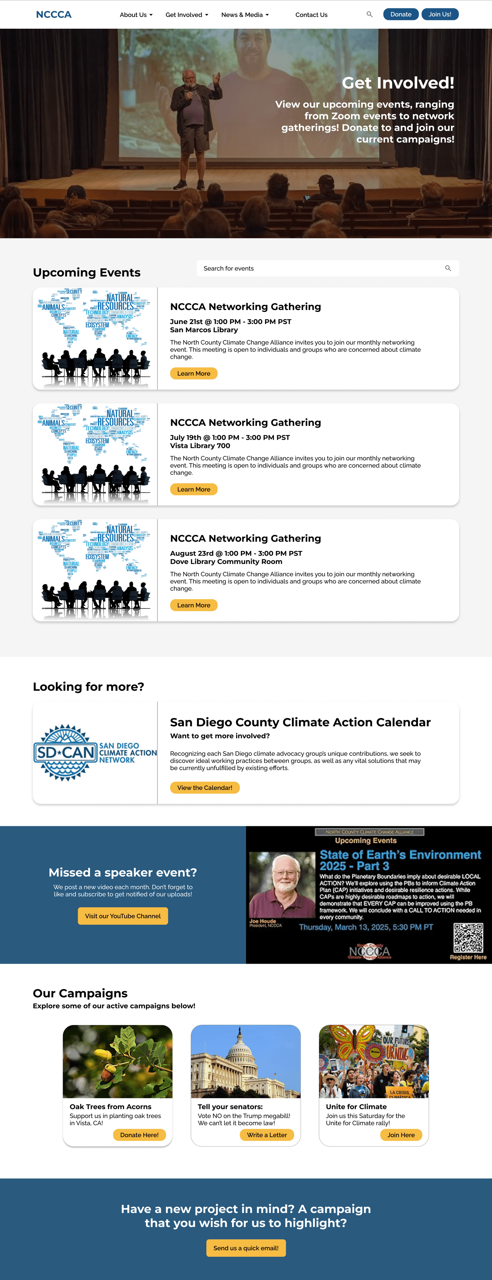
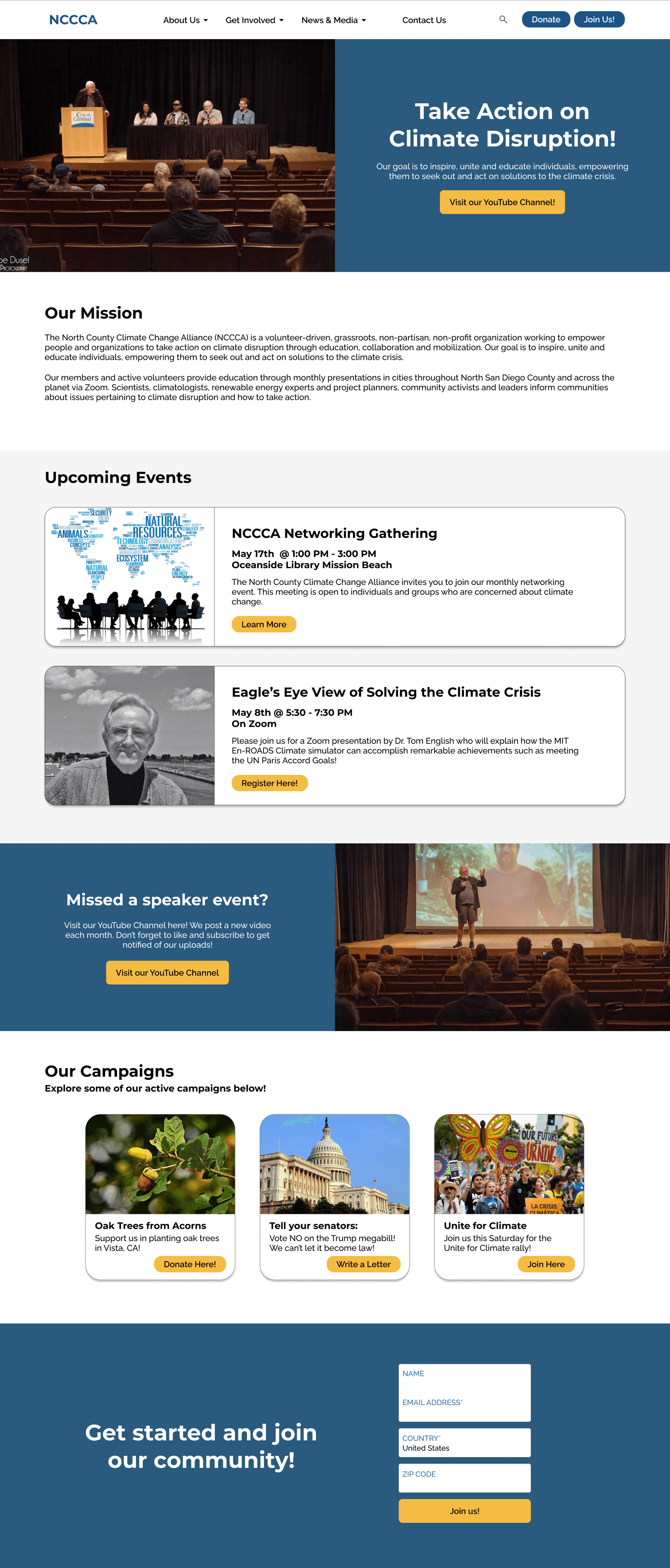
The redesigned homepage immediately introduces NCCCA’s mission and invites visitors to take action.
A prominent hero section with a clear CTA encourages users to “Take Action on Climate Disruption.”
Dynamic content blocks highlight current campaigns, upcoming events, and featured resources.
Integrated newsletter sign-up keeps users engaged beyond their initial visit.
Home Page
BEFORE
AFTER

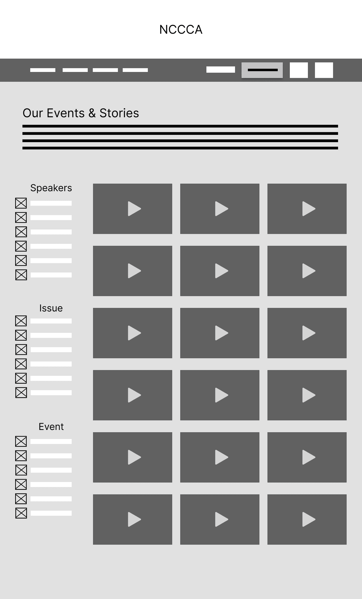
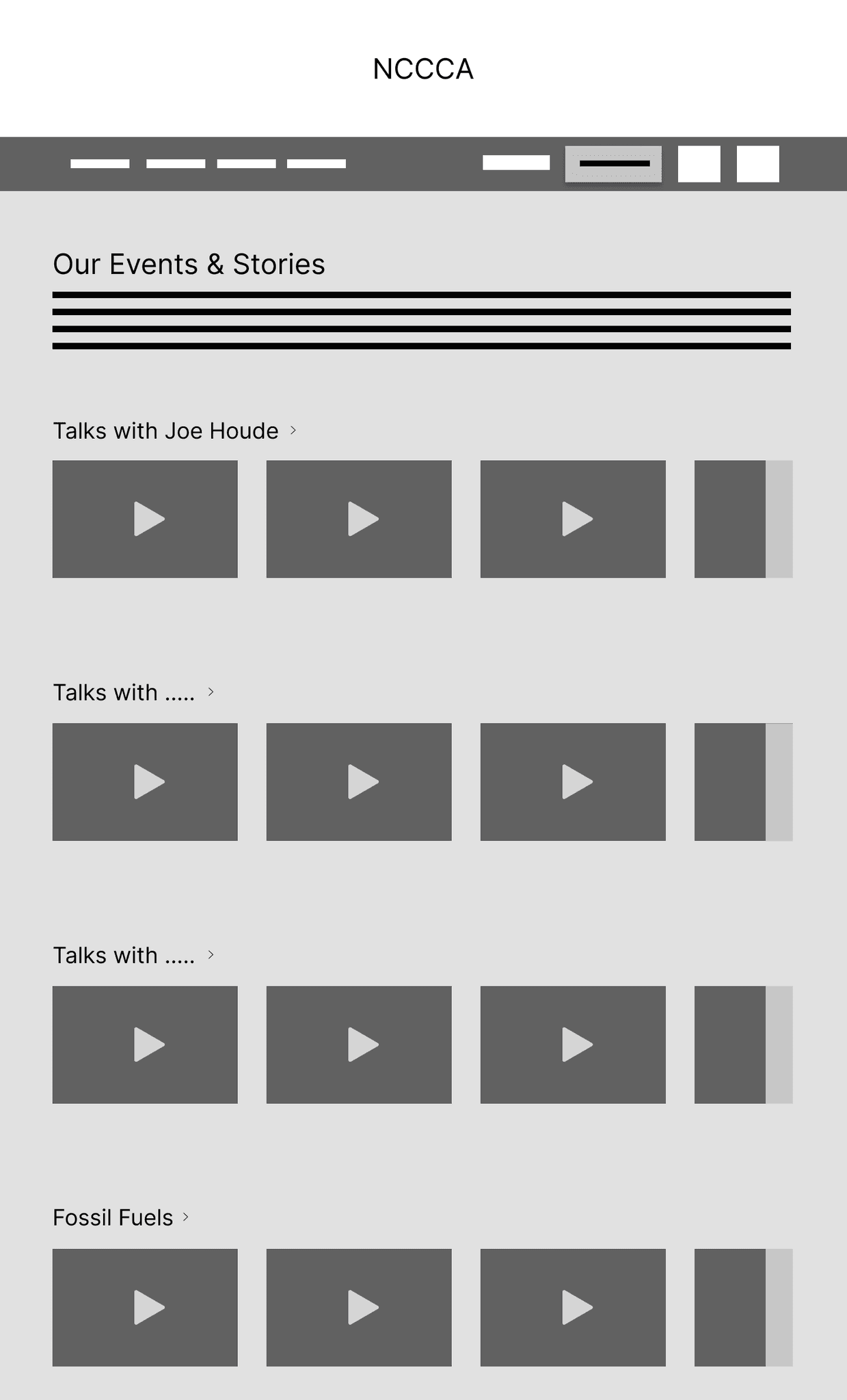
NCCCA's YouTube videos are now organized by date with visual cards along with the ability to search for a specific speaker.
This layout also allows users to quickly learn about the upcoming Zoom event and a way to register for that event!
BEFORE
AFTER
Media Library

A dedicated space for NCCCA’s ongoing initiatives — such as the Oak Tree Planting and TJ Beach Cleanup — gives visitors an immediate way to contribute or learn more.
Each campaign features clear descriptions, images, and direct donation or volunteer links.
Campaigns & Projects


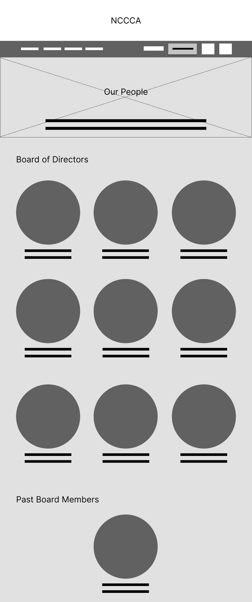
The updated Our Team page arranges member photos in a clean grid layout, reducing unnecessary scrolling and creating a more balanced visual hierarchy.
Our Team


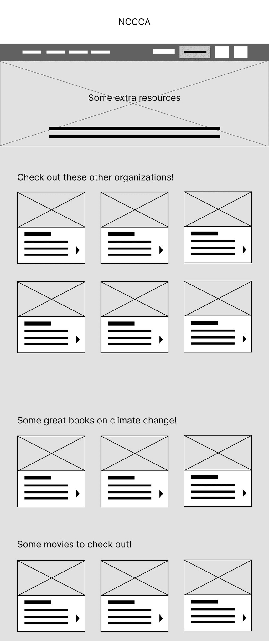
Other Pages
Iterations & Stakeholder Feedback
Throughout the 10-week project, I met weekly with NCCCA Board Chair, Joe Houde, and Board Member, Niels Lund, to share progress and gather feedback. These ongoing conversations helped ensure that every design decision aligned with both organizational goals and user needs.
Each review session served a unique purpose — from validating content hierarchy to refining visual priorities and usability details. The feedback process became a collaborative cycle of testing, adjusting, and improving.
Before and After Feedback: Home Page
BEFORE
AFTER

Joe requested to have upcoming events near the top of the page, as he wished for people to see this first.
Joe wanted to add more photos to the Home page to showcase their community!
Board members wanted to add the San Diego Climate Action calendar of events to the Home page.
Provided to users more ways to get involved with quick links to those resources!
By incorporating weekly feedback loops, the design evolved into something that truly reflected NCCCA’s values—educational, inclusive, and action-oriented. This iterative process not only strengthened the final product but also built trust and collaboration with the client, ensuring a smoother handoff and long-term sustainability.
Implementation and Handoff Guide
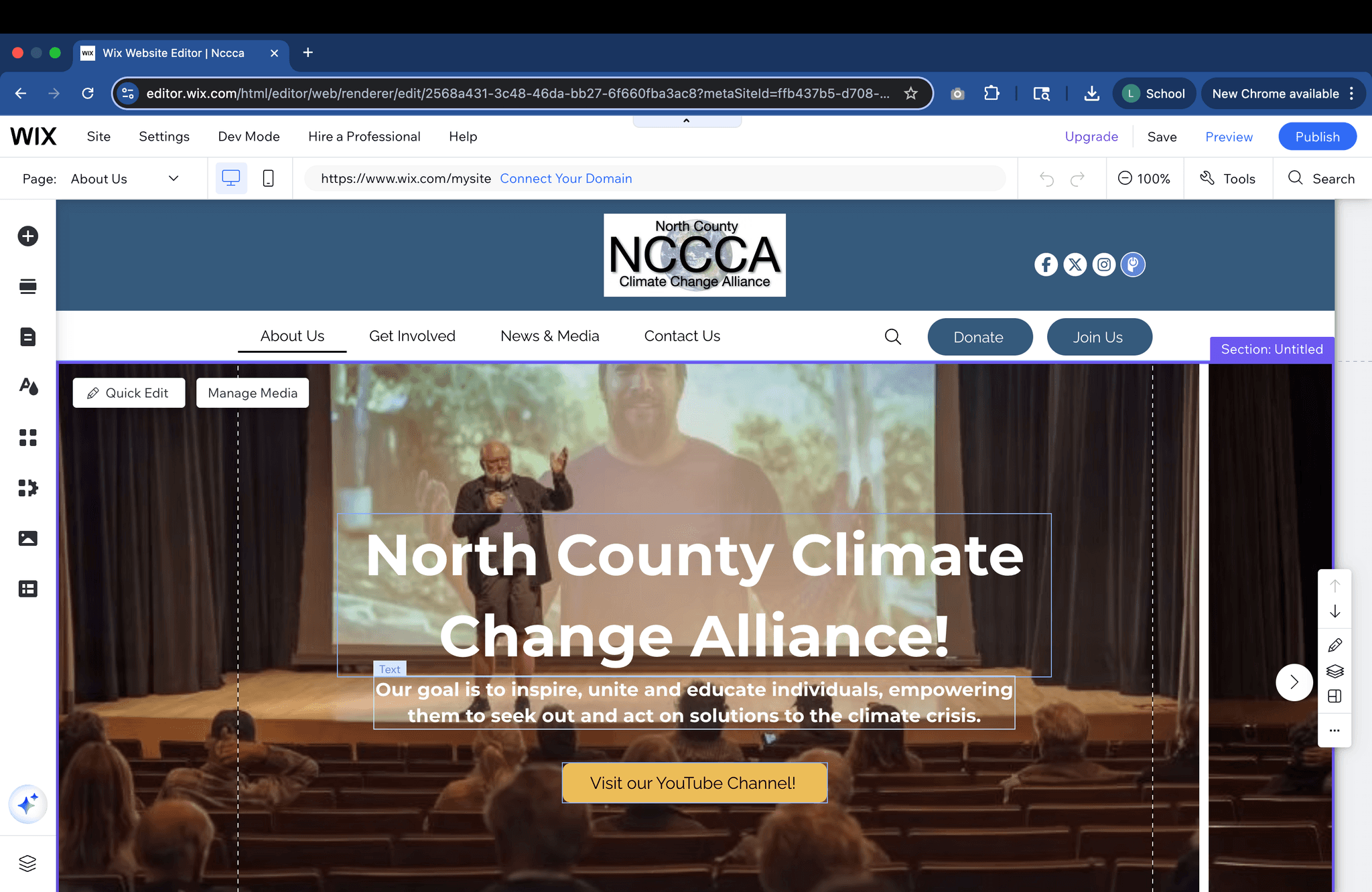
Once the final design was approved, I transitioned the project into Wix to ensure that the NCCCA team could easily manage and update their site without needing technical assistance. My goal was to create a maintainable, flexible, and user-friendly platform that aligned with their volunteer-based structure.
I implemented the redesigned site directly in Wix, customizing page layouts, styles, and navigation based on the finalized Figma prototypes. Each page was built with modular content sections, allowing future volunteers to update campaigns, resources, or events with minimal effort.
To make the transition seamless, I created a Handoff Guide documenting all key setup steps and maintenance instructions. The guide was written in plain language to ensure accessibility for non-technical team members.
Included in the Handoff Guide:
Step-by-step instructions for editing pages and updating content.
Connecting a custom domain and setting up payment methods.
Configuring automations for newsletters, event reminders, and contact forms.
Tips for maintaining consistent branding and layout across new pages.
SEO and mobile optimization recommendations.
Wix Implementation
Handoff Guide
Lessons & Next Steps
Overall, it was very cool and inspiring to be able to work with a non-profit organization such as NCCCA. Their passion for education and action pushed us to design with purpose and empathy! This experience was not only about improving a nonprofit’s online presence but also about learning how to collaborate, adapt, and design for real-world impact.
I also learned to design with sustainability. Building in Wix helped me think about long-term usability—creating a system that non-designers could manage confidently after handoff.
Lessons Learned
Looking ahead, there are opportunities to continue improving the NCCCA website. Future steps could include tracking engagement through analytics, and expanding the Campaigns section with interactive storytelling features. As NCCCA continues to grow, the design system can easily scale to include new initiatives and partnerships.
I also hope to improve the site by performing more usability testing with members of the organization! Due to time constraints I couldn't do as much testing as I wish by I do hope to come back to this project and improve it.
Next Steps
Let’s Connect!
Feel free to contact me to discuss everything and anything at all!
Email: l7ramirez@ucsd.edu